Why these design guidelines ?
GoodBarber is a no-code app builder launched in 2011. It allows anyone to create their own native app or Progressive Web App without needing to write any code. This is a powerful tool for people who want to create an app but don't have the technical skills to do so. From the start, it has been in our DNA to provide the technology and the resources to turn app designs into stunning realities. We strive to continue providing the best solutions for beautiful app creation.
When GoodBarber was first launched, the field of user experience (UX) design was not as widely understood or adopted as it is today. In the past, before the existence of design systems, creating mobile apps was often a challenging process for designers and developers. Without a set of consistent guidelines and best practices to follow, it was difficult to ensure that the app was visually consistent and easy to use across its different screens. Designers and developers also faced a lot of inefficiency when creating new features, as they would often have to start from scratch each time. This resulted in a lot of wasted time and resources. Moreover, collaboration and communication were also difficult, as there was no shared language or set of standards among team members.
Since then, designers' methods and tools have evolved considerably. Design systems have helped to overcome these challenges by providing a set of guidelines and best practices that designers and developers can follow. As GoodBarber's platform has evolved, we realized the need to rethink the design of our templates in their entirety in order to gain visual consistency across platforms and speed up the development process. We have done so by creating the GoodBarber Design System, a set of guidelines and best practices to ensure consistency, efficiency, collaboration, scalability, branding and accessibility in the design process.
By publishing the GoodBarber Design System to the public, we share with anyone our design principles, that have been developed and refined over the years. This can help power users to also achieve consistency, efficiency and scalability when creating custom plugins or making advanced customization in their app.
For the GoodBarber team, the GoodBarber Design System streamlines the app development process, ensures a consistent user experience, and improves the overall quality of the apps you create with our technology
Developers have access to the technical specifications of the pages and components: their size, their positioning, their behaviors and their properties.
Designers can rely on a set of spacing rules, font sizes, image ratios or color distribution for the creation of new pages.
Objectives

Streamline template creation and production by implementing construction principles.

Ensure visual consistency between the pages of an app across different platforms.

Guarantee a smooth and optimal user experience
What is a good design ?
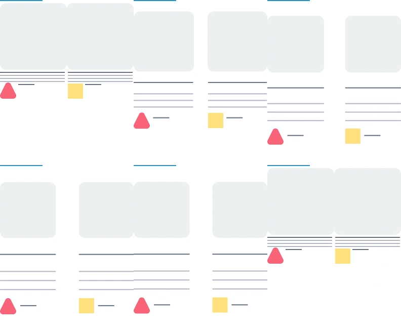
Good space management
In design, "white" space, also known as negative space, refers to the empty space between elements on a page. It is often considered to be wasted space when in fact it plays an important role in creating a clean and uncluttered design. It helps to separate and highlight different elements, making them easier to read and understand. Additionally, "white" space can also create a sense of hierarchy, guiding the user's eye to the most important information on the page.
Finding the same spaces between elements is also a simple way to ensure visual consistency between pages. Using a grid to ensure alignment of text is a common technique used in graphic design and typography. We will therefore rely on a grid to ensure alignment, which is essential for a fluid reading. Recurring spacing values should also be chosen to ensure consistency across the different sections on all devices.

Clear hierarchy
A good contrast between the different text levels is essential for creating a visually organized and easy-to-read layout. The use of different text sizes and styles, such as headings and body text, helps to create a hierarchy of information and guide the user's eye through the layout.
In our design system, we use the golden ratio to establish the size ratio between headings and body text. The golden ratio, also known as the "Divine Proportion," is a mathematical ratio that is often used in design to create visually pleasing and harmonious designs. By using the golden ratio to establish the size ratio between headings and body text, we are able to create a contrast that is both aesthetically pleasing and functional.
Additionally, we also use other typography techniques such as weight, color and spacing to create a contrast between different text levels, this way we can make sure that the headings stand out from the body text and guide the user's attention. By using these techniques, we are able to create a visually organized and easy-to-read layout that guides the user through the content in a clear and seamless way.

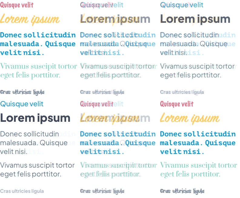
Good font and color management
A design that uses too many typefaces and colors can give off the wrong image by creating confusion. Limiting these elements is a good practice that helps to clarify the content.
In our back office, before any other action, the user is invited to select a theme that they can then customize to create the visual identity of their app. This user flow allows a certain framing: indeed, the proposed themes are built with a limited number of fonts, selected to form nice combinations Heading/Body.
The color palettes are limited to 4 main colors and their good distribution takes part in the hierarchization of the information (for example: a primary color for the brand and the buttons, one or two secondary colors for the less important buttons, the links etc).

This framework makes it possible to apply an efficient default design to apps, but GoodBarber also allows advanced users to customize their product in a very precise way, well beyond the basic recommendations.
The GoodBarber Design System
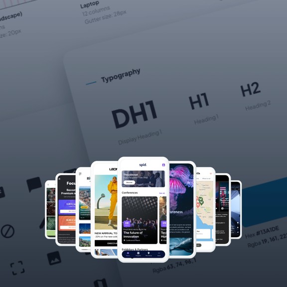
The GoodBarber Design System is a comprehensive solution that serves as a framework, toolbox, and graphic charter for designers and developers. It is a collection of evolving guidelines that provide a consistent and cohesive design language across the platform, that designers and developers can rely on to ensure consistency, efficiency, and scalability in their work. It is a guide that helps to establish a common understanding of the design principles and patterns, and also it allows for flexibility and customization when necessary. Overall, the GoodBarber Design System is a powerful tool that helps to streamline the app development process and create beautiful and functional apps.
Foundations
Our design system includes guidelines for how to construct templates that are consistent, efficient, and easy to use
Components
Components in our design system are building blocks that can be used to create a cohesive and consistent design across your app.
Ressources
Our design system includes a library of prototypes and technical specifications for the different screen of the product. These specifications are for internal use by our designers and developers.
 Design