Anatomy
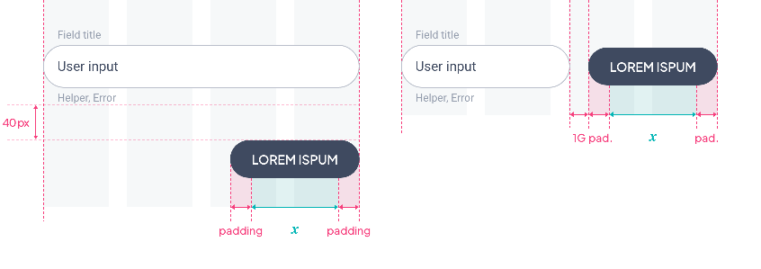
Most of the time, the length of the buttons is dynamic according to the displayed text. Exceptionally, it will be constrained by the layout, as shown here.
The button component comes in 3 sizes: Small, Medium and Large.
Basic button
The padding, font size and height vary depending on the size of the component.
Small
Medium
Large
Icon button
The padding, font size, height and icon size vary depending on the size of the component.
Small
Medium
Large
Font size
Font sizes change only according to the button size chosen and are the same on all devices. For more details on font sizes, please refer to this table.
| Component Size | Text Level | All Devices | ||||||||
|---|---|---|---|---|---|---|---|---|---|---|
| Small | Button 1 | 14 | ||||||||
| Medium | Button 2 | 15 | ||||||||
| Large | Button 3 | 16 | ||||||||
Small
Medium
Large
Properties
Shape
Below, the Shape atom applied to the button with the types Sharp / Rounded / Round:
Sharp
Rounded
Round
Border
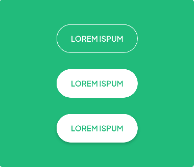
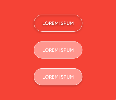
By default, the Border Atom value is 1px when the Outline option is enabled::

Shadow
For more information on the property: Shadow atom section.

Do / Don't
 |  | |
|---|---|---|
| ✓ Do | ✕ Don't | |
| ・Text + Border | ・Text + Border + Drop Shadow | |
| ・Text + Background | ・Text + Background + Border | |
| ・Text + Background + Drop Shadow | ・Text + Background + Border +Drop Shadow |
Layout
Stacked buttons
Mobile
Whether the text is short or long, the button will take up all 4 columns of the page.

Tablet & Web
Even with a very short text, the button will take up at least 2 columns :

If the length of a button exceeds 2 columns, the largest button is used:

Inline Buttons
Mobile / Tablet / Web
Even with a very short text, the button will take up at least 2 columns:

In case of a long text, we cut the word by using ellipsis:

Form
Depending on the device, the layout of a button associated with a Text Field may vary:
On Mobile, the 2 components are one on top of the other because of the lack of space. The button takes up the whole width of the page:

On Tablet and Web, if the 2 components are one on top of the other the button will have its minimum length. If they are on the same line, the Text Field takes the space left by the button:

Modal
1 button: center alignment
2 buttons: right alignment
Footer
If the button is in a footer, the Top and Bottom paddings around the button will be 8px:

 Design