JSON
Here’s the JSON format of this object :
{
"type": { "sharp", "rounded", "round", "custom" }, // Default value "rounded"
"radius": INTEGER, // Used only in case of "custom" shape
}
Documentation
Radius values
These parameters are valid for all devices:
| Sharp | Radius level 0 | ▸ | 0 px | |||||||
| Rounded | Radius level 1 | ▸ | 4 px | |||||||
| Round | Radius level 2 | ▸ | 12 px ou 50% ⚠️ | |||||||
Round Shape Specificities ⚠️
Depending on the component, either a full rounding (i.e. 50% of the total height of the component) or a rounding of 12px will be applied.
There is no real rule and it is the general aspect of the component that takes precedence. This radius is detailed in the section specific to each component.
We can have one of the 3 following cases for a component:
1. Radius of 50% of the total height of the component

2. Radius of 12 px

3. Radius of 50% or 12px depending on the state of the component

Radius distribution
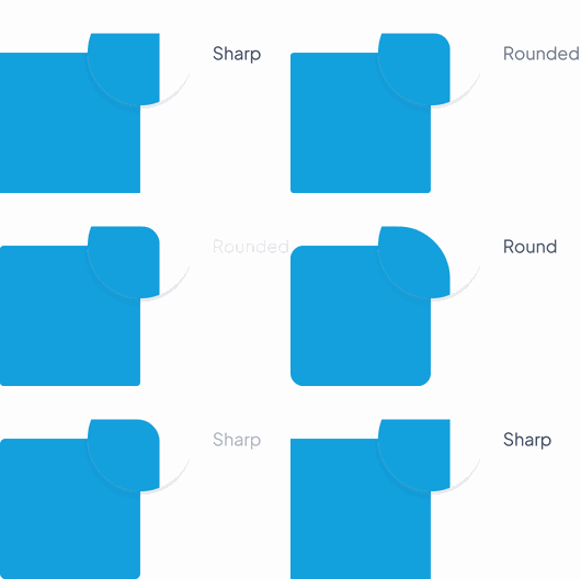
Some components will not receive the Rounded and Round properties on each corner, as can be seen in the examples below.
These values are specified for each component in their respective sections.

 Design