Properties
Shape
Below, the Shape atom applied with the types Sharp / Rounded / Round.
| Title UP | Title IN |
|---|---|
| ↓ | ↓ |
Sharp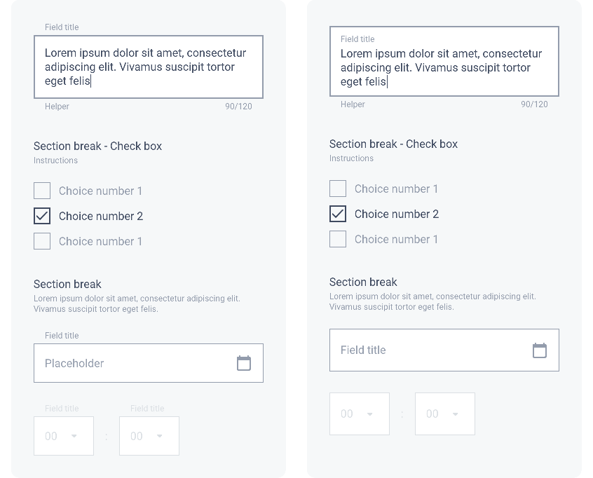
Rounded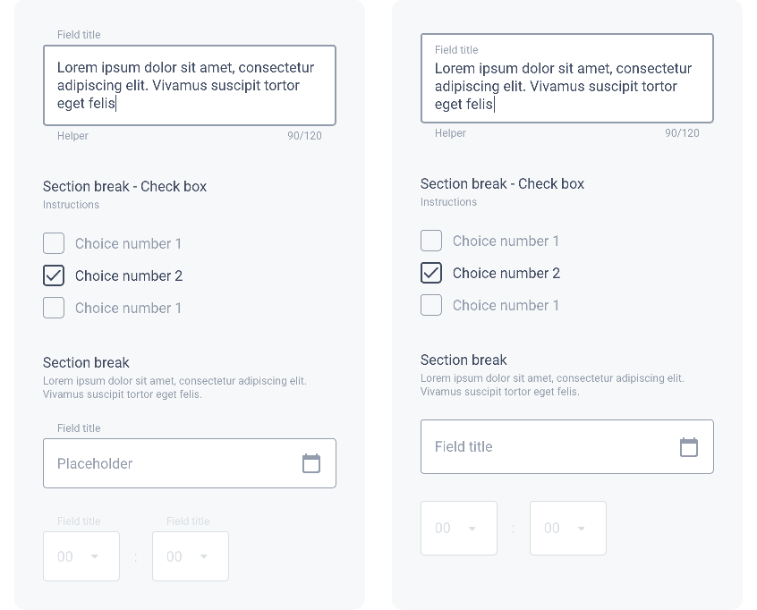
Round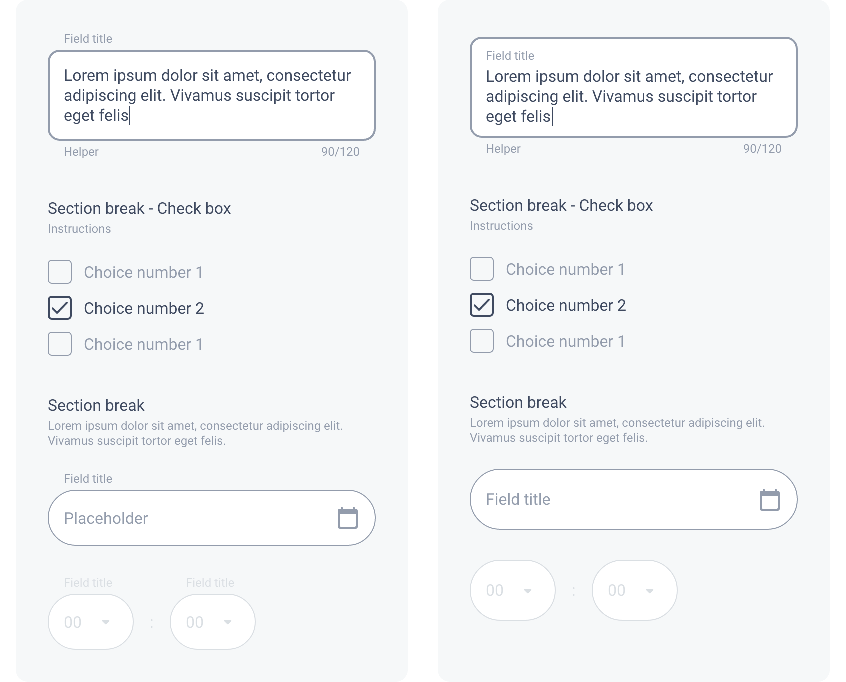
Border
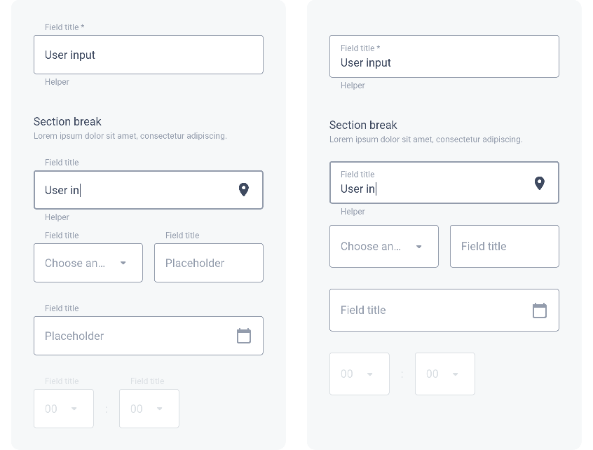
In the example below, we see the Border atom in a Form. The Focus and Focus Error states are differentiated by their thickness of 2px (the default value is 1px).
All the states of a Text Field are described in the section Text Field / Behavior.
| Title UP Round | Title IN Round |
|---|---|
| ↓ | ↓ |
Shadow
The level of Shadow changes for the states Focus and Focus Error. All states of a Text Field are described in the section Text Field / Behavior.
Drop Shadow
Shadow level 1 (Focus level 2)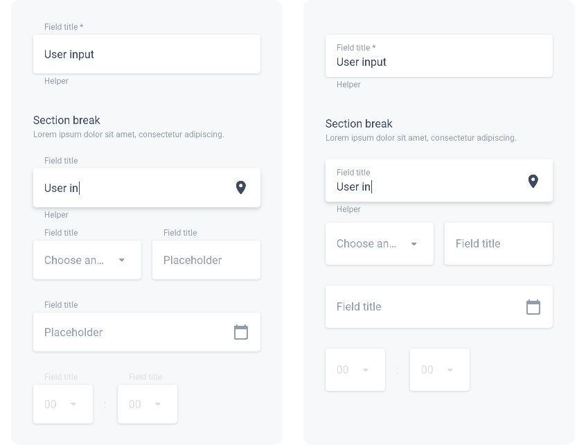
Shadow level 2 (Focus level 3)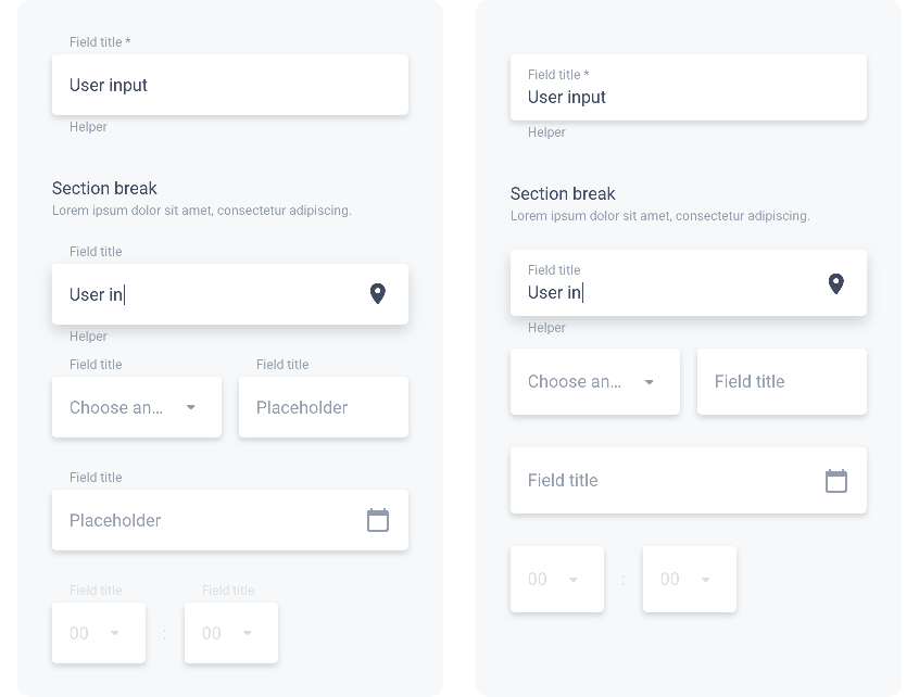
Inner Shadow
Shadow level -1 (Focus level 2)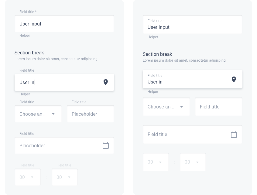
Shadow level -2 (Focus level 3)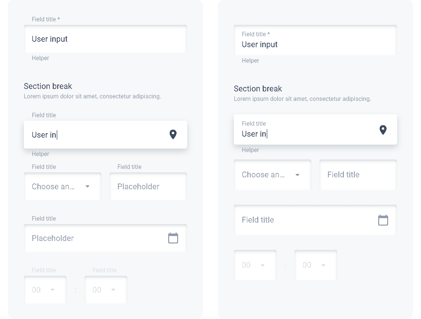
Layout
Vertical spacing between modules of a form are the same on all devices:
| ・ | Before Section Break | ▸ | 40 px | |||||||||
| ・ | Between fields | ▸ | 24 px | |||||||||
| ・ | Between fields in a group | ▸ | 12 px | |||||||||
| ・ | Between 2 fields side by side | ▸ | 1G | |||||||||
The illustration below shows the spacing between elements in a Rounded form on Mobile. Title UP option on the left, Title IN on the right:
 Design