JSON
Here’s the JSON format of this object :
{
"enabled": BOOL // Default value 0,
"position": { "internal", "external" }, // Default external
"color": COLOR,
"type": { "level1", "level2", "level3", "level4", "custom"},
"offset": { x: FLOAT, y: FLOAT } // Used only on custom type,
"blur": FLOAT // Used only on custom type,
"opacity": {0 -> 1} // Used only on custom type,
}
Documentation
Shadow levels values
These parameters are valid for all devices:
| DROP SHADOW | Level 1 | Level 2 | Level 3 | Level 4 | ||||||||
|---|---|---|---|---|---|---|---|---|---|---|---|---|
| Offset Y | ▸ | 1 px | 3 px | 6 px | 20 px | |||||||
| Blur | ▸ | 3 px | 6 px | 12 px | 40 px | |||||||

| INNER SHADOW | Level -1 | Level -2 | Level -3 | Level -4 | ||||||||
|---|---|---|---|---|---|---|---|---|---|---|---|---|
| Offset Y | ▸ | 1 px | 3 px | 6 px | 20 px | |||||||
| Blur | ▸ | 3 px | 6 px | 12 px | 40 px | |||||||

Shadow management
Not all components can receive Atom Shadow, or only in a restricted way. These parameters are detailed in the sections specific to each component. Indeed:
- Some components cannot receive the Atom Shadow
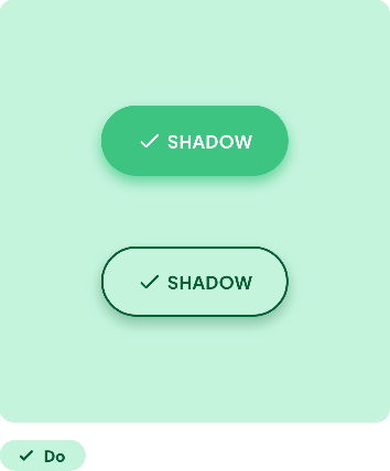
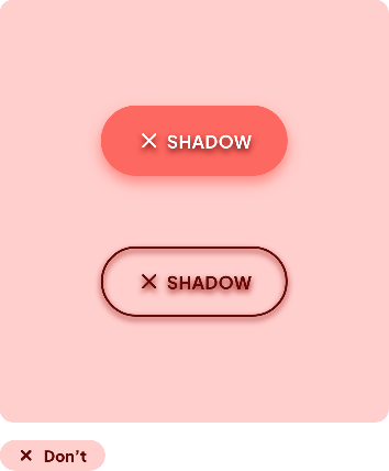
In the example below, we do not apply the Atom Shadow to the text or the outline of the button
 |  |
- Some components can only receive certain levels of shadow
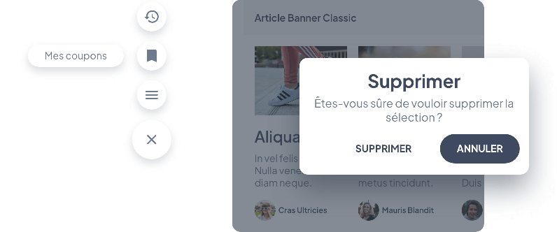
The floating menu and the alert message below should come to the fore, so they will receive high shadow levels (here Level 3 and 4)

- Some components can receive different Levels from the Atom Shadow depending on their state
Below is the behavior of a Textfield changing from Inactive to Active state

 Design