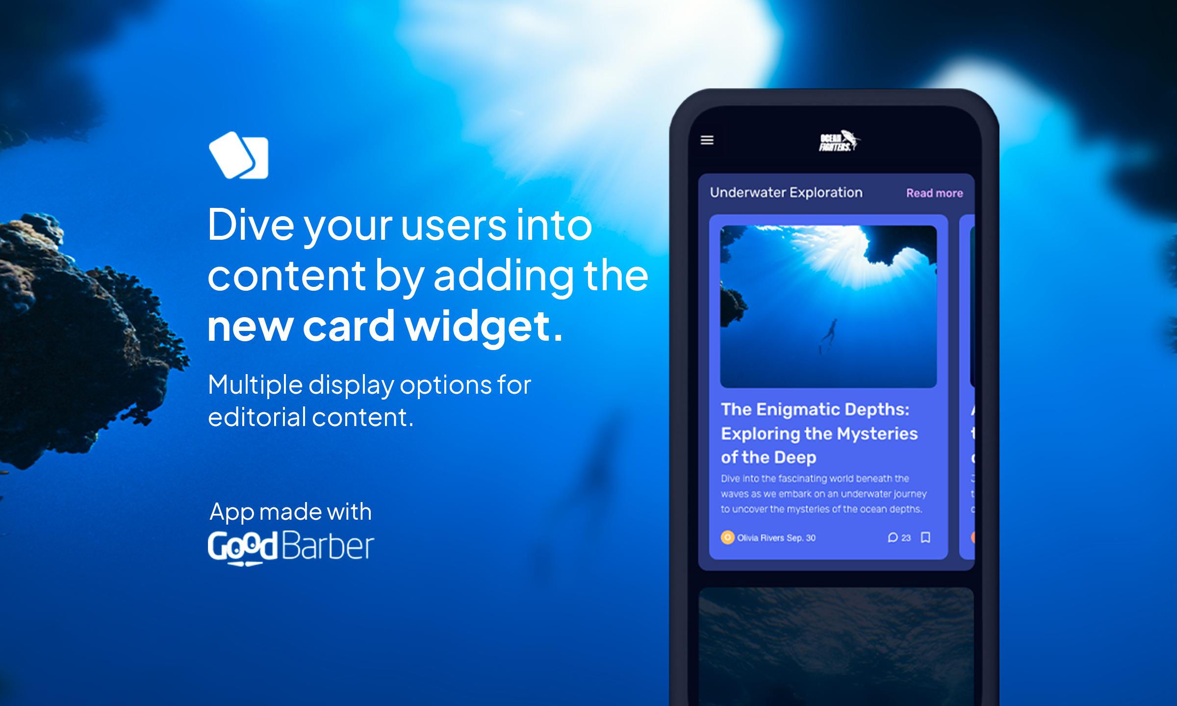
New Visual Cards Template: Reinvent the way your items are displayed on your app's homepage
Written by Muriel Santoni on

At GoodBarber, we're constantly looking for ways to help you create unique and engaging user experiences. With this in mind, we're delighted to announce the release of our latest design gem: the Visual Cards template. Designed specifically to transform the way articles are displayed in a widget on your application's home page, this new design is perfectly in tune with the modern trend towards highlighting editorial content.
The Visual Cards template has been designed to offer your users an enriching and immersive visual experience. Thanks to this modern design, you can now present your articles in an elegant and attractive way, grabbing your users' attention at first glance. Whether you want to showcase news, blog posts or any other editorial content, Visual Cards is the ideal solution for making your content shine.
The Visual Cards template is already available to all GoodBarber users. We can't wait to see how you use this new design to enhance the user experience of your application.
The Visual Cards template is already available to all GoodBarber users. We can't wait to see how you use this new design to enhance the user experience of your application.
How do you apply this template in your application?
In your back office, go to the My App > Structure menu. Choose the Home section, then the widget to which you want to apply the Visual Cards template, or create a new one. All that's left to do is select the Visual Cards template and set its parameters.
 Design