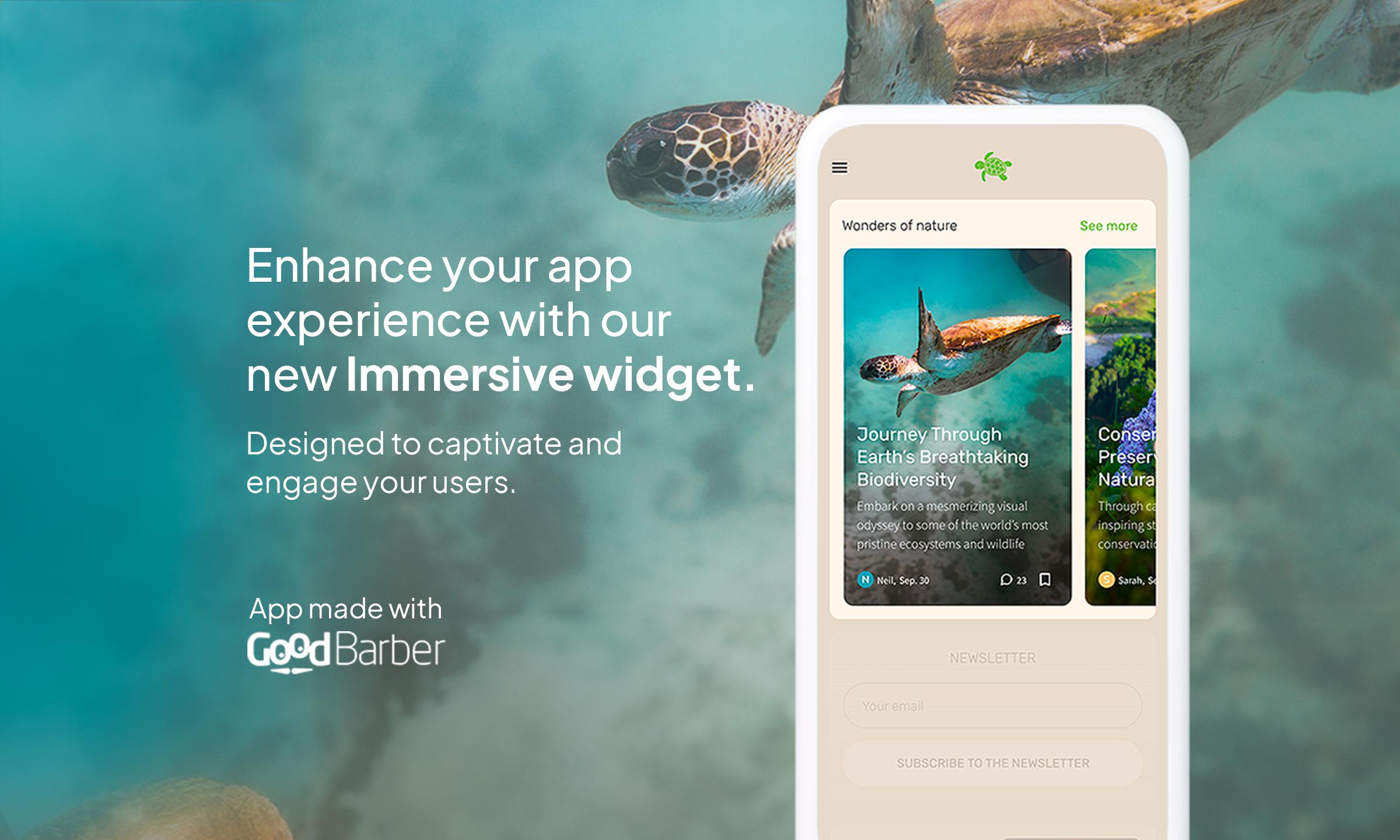
Immersive Card Banner: the new template for a deeply engaging user experience
Written by Muriel Santoni on

We are thrilled to unveil our latest breakthrough in interface design: the Immersive Card Banner template. Crafted to elevate the display of your articles on your app's homepage, this template brings a striking visual dimension that will surely engage your users.
Dive into a new visual dimension
The Immersive Card Banner pushes the boundaries of traditional content presentation. With its sleek design and emphasis on large-scale visuals, this template is an invitation to exploration. Users are greeted with immersive banners that showcase each article, thus creating a seamless and intuitive navigation experience.
Today's users seek immediate and meaningful interaction with the content they consume. The Immersive Card Banner meets this demand by offering interactive elements, like call-to-action buttons and embedded links, that encourage engagement from the first interaction.
At GoodBarber, we continually push the boundaries of innovation so that your success is ours too. The Immersive Card Banner is another step towards a horizon where every interaction counts. Get started now and watch your content rise to unprecedented heights of engagement and beauty.
At GoodBarber, we continually push the boundaries of innovation so that your success is ours too. The Immersive Card Banner is another step towards a horizon where every interaction counts. Get started now and watch your content rise to unprecedented heights of engagement and beauty.
How do you apply this template to your app?
In your back office, go to the My App > Structure menu. Then select the Home section, followed by the Article widget to which you want to apply the Immersive Card Banner template, or create a new one. All that’s left is to select the Immersive Card Banner template and configure it.
 Design