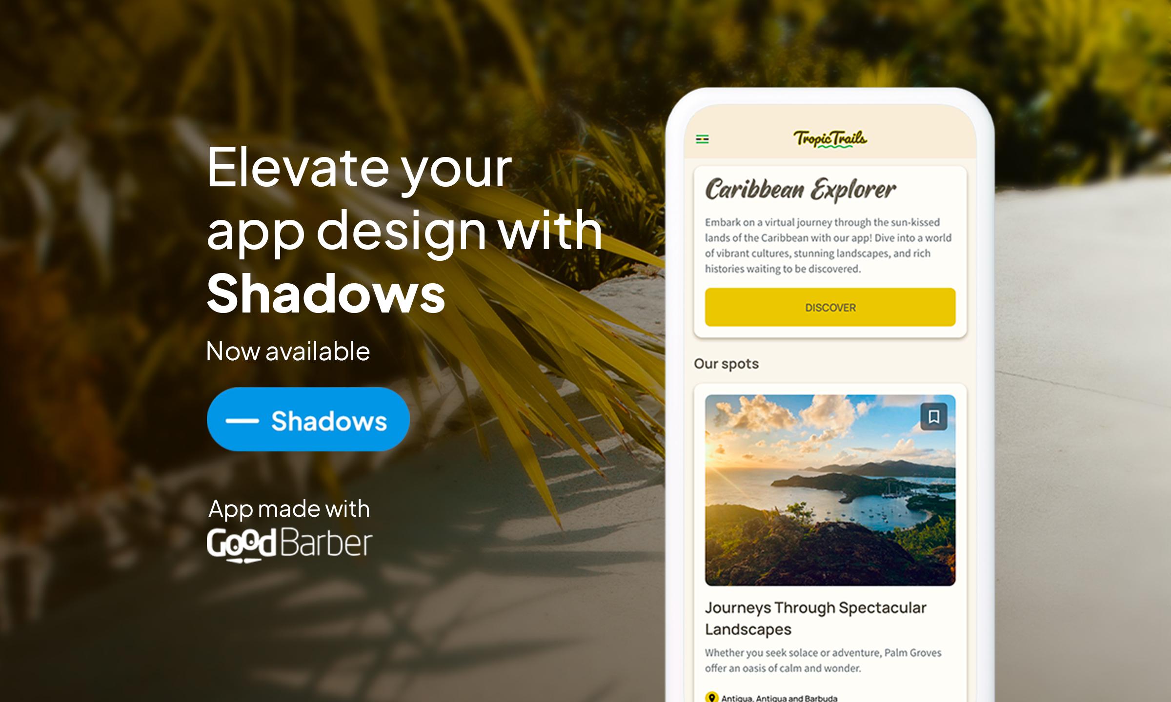
Illuminate your designs with the shadow option
Written by Muriel Santoni on

At GoodBarber, we continuously strive to provide both advanced and aesthetically pleasing design tools. Therefore, we are thrilled to announce our latest design innovation: the Shadow option, now available in our most recent layout models.
The Shadow option allows you to add subtle and elegant shadows to various elements of your templates, thereby enhancing the overall aesthetics of your projects. This feature has been designed to provide increased visual depth and a more refined look to your creations.
The Shadow option allows you to add subtle and elegant shadows to various elements of your templates, thereby enhancing the overall aesthetics of your projects. This feature has been designed to provide increased visual depth and a more refined look to your creations.
Introducing the Shadow option into your projects offers multiple benefits. First, the shadows add a visual dimension that helps your elements stand out, creating both a subtle and powerful visual impact. This feature also increases customization possibilities, allowing you to fully control the appearance of your elements for a design that is uniquely yours.
How to activate it on your app's designs?
To simplify the user experience and avoid any confusion, we have integrated the Shadow option directly into certain specific templates, rather than as a global option. This approach ensures intuitive and targeted use, given that the effect is not compatible with all project views.
Activating the Shadow option is straightforward:
Activating the Shadow option is straightforward:
- Select a model compatible with the Shadow effect.
- Enable the option in the settings.
- Customize the shadow according to your preferences to adjust the intensity and angle, ensuring it perfectly matches the aesthetics of your project.
 Design