How to create an app for an non-profit association or a political organization
Written by Muriel Santoni on
One of the major issues for a non-profit association or a political organization is certainly communication. Indeed, it is essential for this type of structure to implement effective, easy to execute and especially inexpensive strategies. When we are at the head of an association, our ambition is to rally a maximum of people to the cause that drives us, but also to organize the life of the structure and to retain the existing members. These are several objectives that can be difficult to achieve if you don't have the necessary means and teams. If you are in this situation, creating an app for an association or a political organization can definitely be an ideal solution to allow you to spread the word about your cause and organize the life of your organization without having to invest too much time and money.
The days when activism was limited to putting up posters in the streets or physically demonstrating are over. Today, most of the battles are also fought digitally and through the creation and distribution of content. Internet and social networks have changed the way we convince people and make our voices heard.
What better way to defend a cause than to talk about it, explain it and convince new people to join you? An app allows you to spread your message to as many people as possible and to communicate in real time with your audience. It's a great way to gain visibility and reach new people.
Speaking of your activists and volunteers, they are the heart of your organization. Their commitment is valuable and you need to provide them with the right tools to make them as loyal to your association as possible. With an app, you will provide them with a dedicated space where all the information they need will be gathered and where they can exchange.
Finally, your app will provide you with an optimal digital presence and will give your organization a professional style that will only improve its reputation. At first sight, your structure will be perceived as well-organized and modern. Your future members will be able to tell with certainty that you have at heart to deploy the necessary means to promote your cause as it should be.
With GoodBarber, you can create an app simply, without the need for special skills, and especially for a budget lower than any traditional communication campaign.
Convinced? Then it's time to get started! In this article, you will find the main steps of designing an app for associations and political organizations, supported by two examples of apps you can use to create your own app.
If you've never created an app before, feel free to check out our article on how to create an app or our blog which is full of tips on how to make your project a success.
What better way to defend a cause than to talk about it, explain it and convince new people to join you? An app allows you to spread your message to as many people as possible and to communicate in real time with your audience. It's a great way to gain visibility and reach new people.
Speaking of your activists and volunteers, they are the heart of your organization. Their commitment is valuable and you need to provide them with the right tools to make them as loyal to your association as possible. With an app, you will provide them with a dedicated space where all the information they need will be gathered and where they can exchange.
Finally, your app will provide you with an optimal digital presence and will give your organization a professional style that will only improve its reputation. At first sight, your structure will be perceived as well-organized and modern. Your future members will be able to tell with certainty that you have at heart to deploy the necessary means to promote your cause as it should be.
With GoodBarber, you can create an app simply, without the need for special skills, and especially for a budget lower than any traditional communication campaign.
Convinced? Then it's time to get started! In this article, you will find the main steps of designing an app for associations and political organizations, supported by two examples of apps you can use to create your own app.
- Create a design that looks like you
- Present your cause and make it count
- Build a strong community
- Promote all your events
- Raise funds
- Create a powerful mutual communication space
If you've never created an app before, feel free to check out our article on how to create an app or our blog which is full of tips on how to make your project a success.
1. Create an app that reflects you
This step is one of the most important. The design of your app should reflect who you are and should make your advocates feel at home. Don't neglect this step of creating your app: the design of your app will be the first thing your future members will see of you.
The first step is to choose the colors of your app. In your GoodBarber back office, many themes created by our design team are at your disposal as a starting point for your app. You can modify all the details of your design: color palettes, typography, icons, and effects... you have a lot of choices. Also, consider adding your own logo to the app to ensure visual continuity with your existing materials.
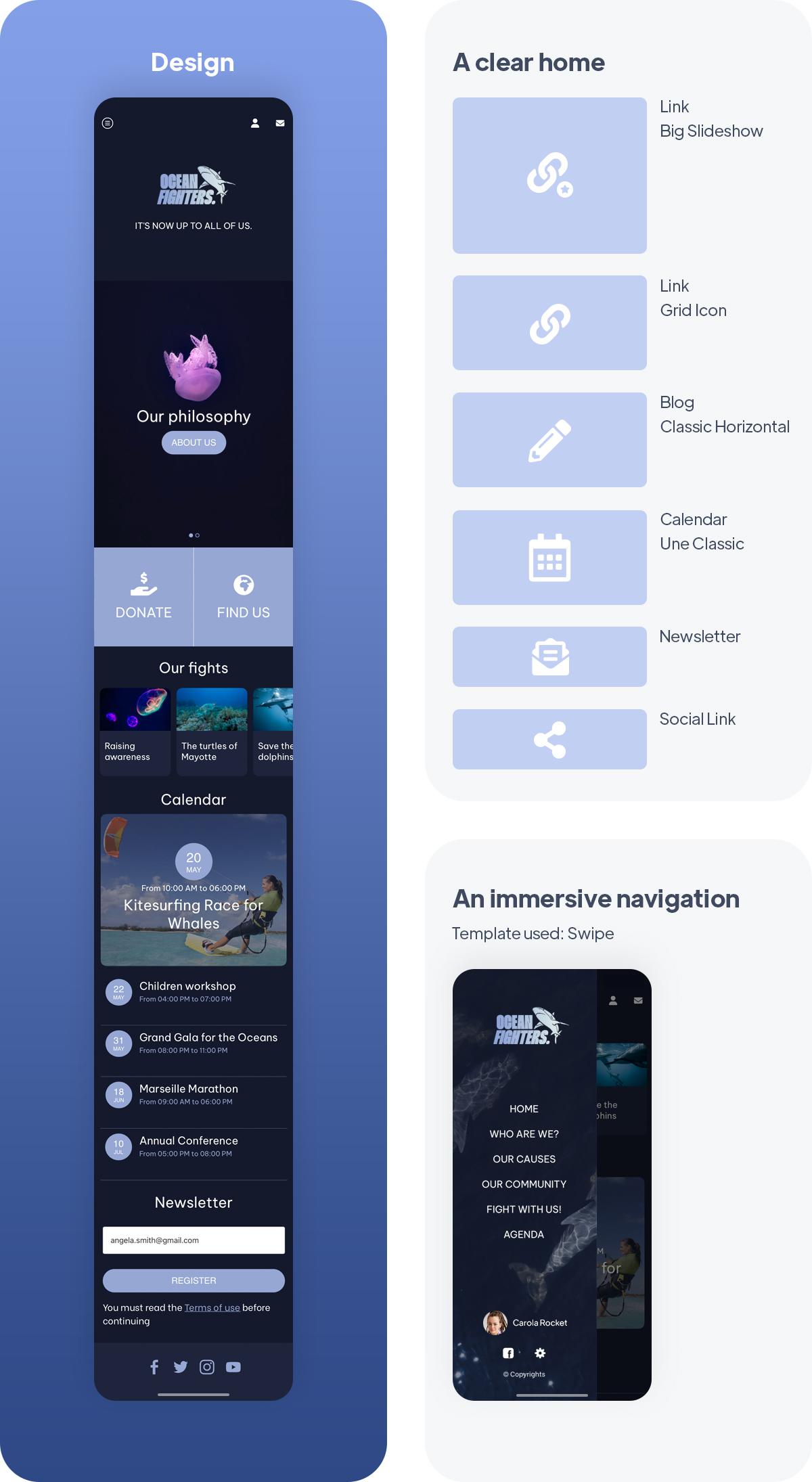
If your association already exists, you probably already have a visual identity that you use on your T-shirts, posters, or other goodies. If not, this is the perfect opportunity to get started. In any case, your app should look like you. Each association or political organization has its own struggles and it would be reductive to orient you on this or that color. However, we can show you a concrete example of what can be done. Let's take the example of our app Ocean Fighters which is the app of an NGO that fights for the protection of the oceans and the sea bed. In this case, we chose a very dark color base that reminds the depth of the ocean. This black blue was softened by touches of purple and plum that bring contrast while maintaining the cold aspect of the aquatic environment.
Once you've chosen the broad lines of your app's design it's time to tackle its architecture. As we have seen above, your app will serve several purposes and address different targets, so its structure must be clear and the navigation fluid and intuitive. For this, your first tool will be the Home of your app. This is your home page. It will group all the main contents and features of your app thanks to widgets. You'll see it's very simple. Let's take our example of Ocean Fighters. Its homepage includes first of all an Articles widget that links to the articles presenting the association. It allows you to immediately jump in and understand who is behind the app. As you can see, the images of the articles have been chosen to blend perfectly with the design of the app. Then there is a Links widget that highlights two key features for the association: a link to the Donately section, to collect donations, and a link to a Map section that lists all the association's HQs to encourage a maximum of new recruits.
Further down we present a new Articles widget which displays detailed information about the fights led by the association and a Calendar widget which lists the next actions. Finally, we find two more "social" widgets with a Newsletter widget and links to the association's social networks.
In parallel to the navigation offered by this Home section, we have chosen a Swipe navigation mode. This navigation mode is particularly adapted when you want to integrate more than 6 sections or links. Here the menu is a design element in its own right since an image has been inserted in the background. It allows making a visual reminder of the action of the association. The swipe also allows us to highlight the name of the sections listed in the menu. In addition to the main links to the content or donation sections, we added secondary links to the user profile, the app settings, or the association's Facebook page.
2. Present your cause and make it count
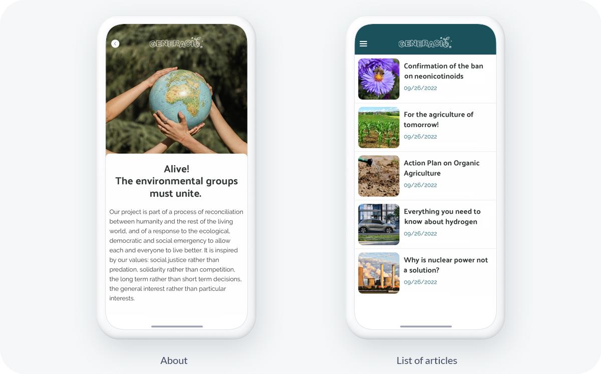
Your app is the best place to present in detail your combats, your actions, or even your organization and its members. You can create all the content you want and organize it the way you want: menu section, categories, everything will depend on the amount of content you have and the way you segment it. To illustrate this let's take the example of our second app Generacio. It's the app of an environmentalist political party. Several content sections have been used to present the party and its actions. First, we have an About section which is used to present the party, its history, and its operation. Then an Articles section was used to talk about the party's positions and priorities.
A Menu section has also been used to create a secondary navigation, it combines the About section we just talked about and a Calendar section that lists all the upcoming events in the calendar of Generacio (we talk about it a little bit below).
A Menu section has also been used to create a secondary navigation, it combines the About section we just talked about and a Calendar section that lists all the upcoming events in the calendar of Generacio (we talk about it a little bit below).
If you wish, you can also use different types of content: photos, videos, articles, podcasts, or even live video and audio, it's up to you!
3. Build a strong community
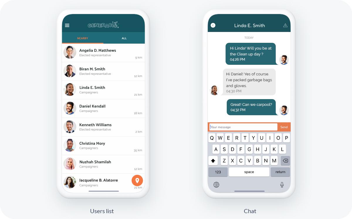
In addition to presenting your organization, your app is the ideal place to encourage exchanges between your members and to encourage them to create connections between themselves and you. Several features are available to give an ultra-social dimension to your app. First of all, an authentication system that allows your members to have their own user profile. You can then classify each member into user groups. For example, in the Generacio app, there are two groups: a group listing all the elected members of the association and a group with the militants. This way you can set up targeted communication strategies and create exclusive content for each target.
The Community extension allows you to display the list of your users in your app. This way, each user will be able to see the profile of the others and foster a sense of belonging to your structure. To go further, you can also integrate a chat system into your app to give users the possibility to contact each other. This can be a very powerful feature if you want to build a strong and engaged community. Users who do not wish to be contacted will however have the possibility to disable this option in order to respect everyone's wishes.
The Community extension allows you to display the list of your users in your app. This way, each user will be able to see the profile of the others and foster a sense of belonging to your structure. To go further, you can also integrate a chat system into your app to give users the possibility to contact each other. This can be a very powerful feature if you want to build a strong and engaged community. Users who do not wish to be contacted will however have the possibility to disable this option in order to respect everyone's wishes.
4. Promote all your events
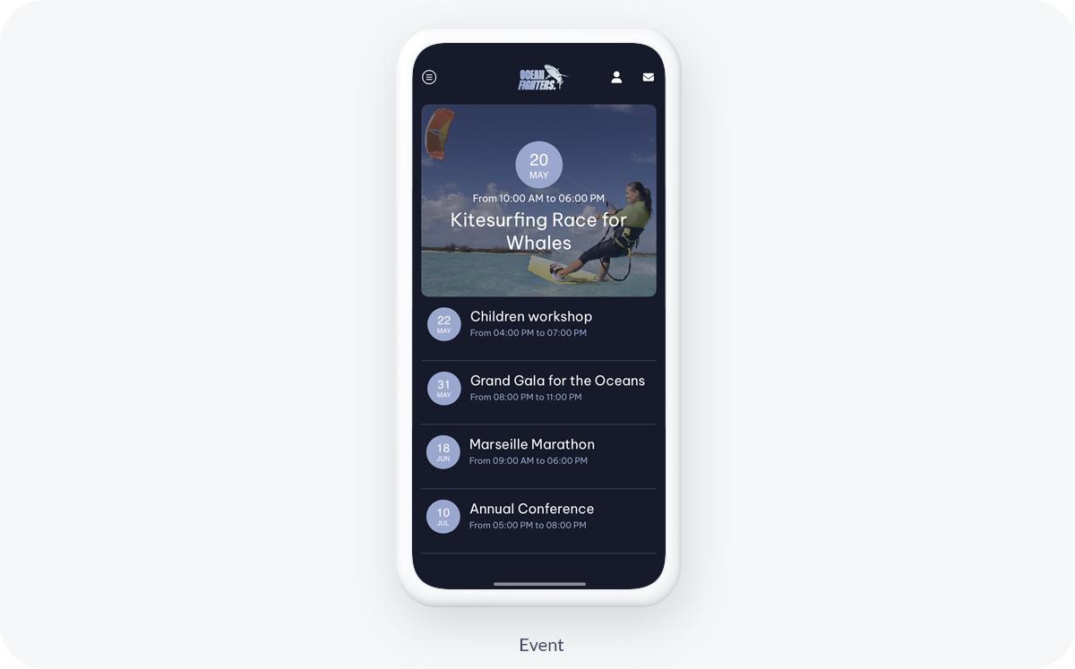
As an association or a political organization, you need to present your calendar in your app to attract as many people as possible to your events! Many events will punctuate your year: conventions, demonstrations, press conferences, and actions of all kinds are all appointments around which you must communicate. With GoodBarber you can display the events you have created from your back office or retrieved from an external source and centralize them all in your app. Your members will have an overview of your calendar. They can even add them directly to their own calendar.
5. Raise funds
As you know, money is the lifeblood of any organization and it is essential to raise funds to keep your organization alive. There are several solutions to raise money with an app. We recommend two that correspond to your activity:
Fundraiser: you can connect your Donately account to your app and raise funds in a simple and secure way. This extension installs in one click and allows you to collect your funds from your app while managing your donations directly from your Donately account. You will be able to integrate donation forms into your app, as well as collection pages, for an optimal user experience.
Integrate advertising into your app: You can use different areas of your app to display ads. You can sell these ad spaces to a third-party ad network, like AdMob or Facebook for example, which will automatically display ads in your app. Alternatively, you can sell these spaces to partners and manage the ads displayed in your app yourself.
6. Create a powerful mutual communication space
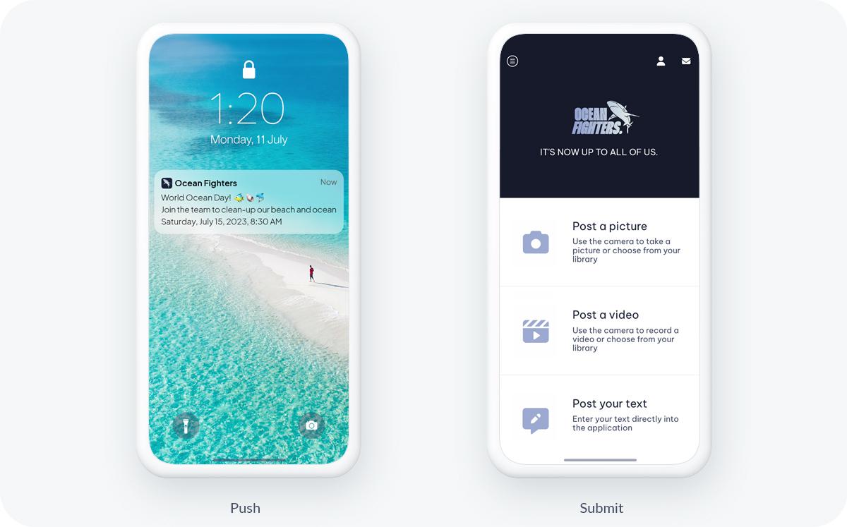
Your app is also used to communicate with your volunteers and activists. GoodBarber's Extension Store allows you to integrate many features into your app that will help you stay in touch with your community.
- Submission section: it allows your users to share content on your app. Texts, images, or videos, your activists and volunteers can send you content in one click.
- Form section: integrate a form into your app. Surveys, information requests, polls... let your imagination play to collect the information you need.
- Push Notifications: send them automatically when new content is published or manually to communicate efficiently and instantly with your users.
 Design