How to create an app for a Radio station
Written by Muriel Santoni on

Radio has the advantage of being a media that can be consumed everywhere and that is not exclusive: it is largely possible to listen to a radio station or a podcast while practicing an activity on the side. Moreover, since 2017, the cell phone has become the first screen to surf on radio and music websites and applications. The stations have really digitized their offers and it's not for nothing.
At the same time, streaming radio and podcasting consumption habits are becoming more and more significant. Offering an app for your radio will allow you to stay close to your listeners and of course to convince new ones. It will allow you to explore new ways of communication and to diversify your content types.
If you’re new and never created an app before, we share our best tips on how to make an app following a few keys steps and other best practices in our blog,
The new challenges for radios
First of all, as you've already understood, consumer habits have evolved. Today, a large majority of listeners want to be able to access your content at any time. Podcasts have been widely democratized. This change in the way people consume information and entertainment, especially among young people, should push you to offer podcasts, videos, or other content to your listeners who are now used to accessing this type of content. Today we identify two major trends of additional content:
- Native podcasts: unedited content in on-demand listening.
- Filmed radio: personify your hosts by allowing listeners to watch behind-the-scenes of your radio shows.
Now that you understand why an app is the perfect solution for your radio, let's move on to the actual creation of the app.
1. Choose a Theme for your Radio app
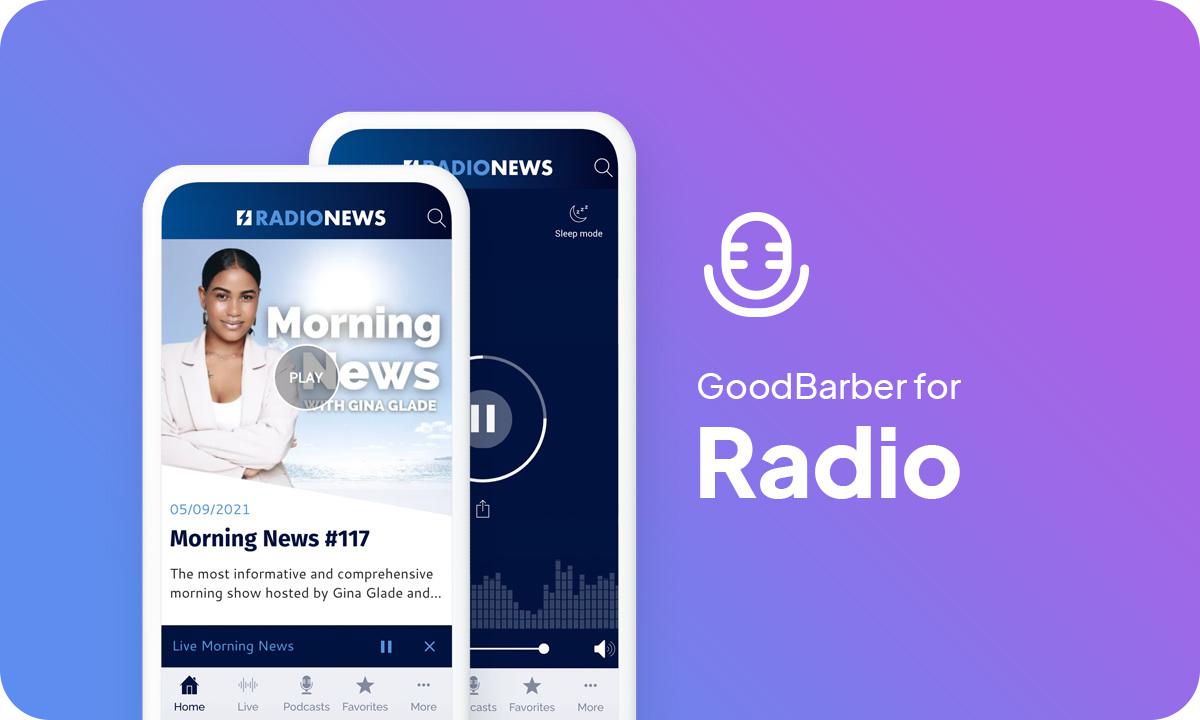
While your app comes automatically with a template and theme, in the back office you will find more than 25 different themes created by our designers. For example, the Radio News app uses the Beckett theme, while the Campus app uses the White Gold theme. But you can choose the theme that best fits your design guidelines.
2. Build your Radio app Home Screen
The Home is a very important feature of your app, both visually and practically. It is the first screen users will see when opening your app.
With GoodBarber, you choose which content to highlight upon opening the app. You can see in the paragraph about UX and content how you can optimize your modular Home by adding different types of widgets. You will see further below in the article our recommendations to build your Home depending on what type of radio or podcast you broadcast and of course your audience. For example, Radio News is somehow similar to a newspaper targeting an audience who wants to be kept informed of the latest news. That's why their Home presents almost all the podcast sections of the app. They use 2 blog widgets for written content. They also link their social media to attract younger listeners.
*The content that initially appears inside the app is just set as an example, you can change and adjust it as you fill your sections with your own.
3. Build your Navigation Menu of your app
Here for Radio News, we’ve selected the TabBar template and added the Search section in the Header for easy navigation. For this app, the goal was to display clearly all audio sections for easy search. We also use clear colors.
You can further customize your app by featuring your logo inside the Header, on the Home as well as within sections, where each section Header can be customized independently.
4. Add Content to your Radio app
We're almost there! Your app will be ready soon.
5. Design your Launch Screen and App Icon
Last but not least, don't forget to enter the name of your app . The field that appears below the icon preview is the name of the app as it will appear on the Home Screen of the user's smartphone, for today's example: "Radio News".
6. Test and publish your Radio Station app
Your radio app is now ready! But before sharing it with the world, you need to carry out a series of tests to check if everything is running as you've planned. You’ll need to test all versions of the app that you’re planning to publish (native iOS, native Android, PWA, etc.), using different OS and different browsers as well.
GoodBarber provides a test app you can use to run preliminary checks on your app. The most optimal way to test your app, however, is through its AdHoc version, which is the actual file of the app that will be submitted to the stores that you can download onto and run on your device. Other options are available: For native iOS apps, there is a specific tool provided by Apple: TestFlight. It allows testing your app before it goes online on the App Store. Android offers alternatives to Testflight.
Once you’re satisfied with the results of your tests, you can move on to the next step: publishing your app !
Publishing an app can be a complex and slightly overwhelming process, starting with the mandatory step of registering as a developer on both Android and iOS platforms. The Apple developer account is $99/year. The Google Publisher account consists of a one-time fee of $25. Keep in mind that Apple requires the owner of the content in the app to match the owner of the developer account, so if you publish multiple iOS apps for different projects, each will need to have its own individual developer account.
The process of submitting an app to the App Store is slightly complex and requires thorough preparation. Apple reviews each app before approving them for release. Before you submit your app for review, you will need to provide a collection of information (Icon, app preview/ screenshots) and metadata (the name of your app, its category, a detailed description, and additional keywords for ASO). The review process can take a few days, Apple will notify you by email when your app is public.
For Google Play, after creating your app on your Google Play Console you will need to register the information that will be displayed on Google Play. It includes mandatory information such as title, short description, full description, graphic assets (pictures, app screenshots), category, contact details, privacy policy. Once the Store listing is completed, it’s time to upload your app bundle. (it contains all the elements of your application). Then follow the guide on the Google Console to deploy and publish your app. If your app is approved it will be released within a few hours.
Luckily, publishing a Progressive Web App is a lot simpler. Hosting is included with your GoodBarber subscription. However, we highly recommend purchasing and setting up your own domain name. It will help your radio gain visibility and create brand awareness. Also, you want your listeners to easily find you!
Now, let's dive a bit deeper into the key features to use and the UX of a radio app with the examples of 3 apps: Campus, Radio News, and Stadium.
To each type of radio its app

Before you start creating your radio app, you need to ask yourself what is the purpose of your radio. Are you an entertainment radio? Do you already have a strong community or do you want to create one?
In short, take the time to analyze your situation and your ambitions to choose the best features and the best UX for your app taking into account your target and its needs. Here are some examples of apps created for totally different types of radios.
1/ A radio to share your passion
The Stadium radio app serves a radio specialized in sports. It is therefore intended for a well-informed public that comes to look for precise information on a theme that already interests him. Its number 1 objective is to rally around a common passion and to position itself as a reference in this field.
The home of this app has been built around the main contents: the Live and the podcasts. A big call to action is proposed at the top of the list to invite listeners to listen to the live radio stream right away, with a central button in the navigation mode that reminds them of this action.
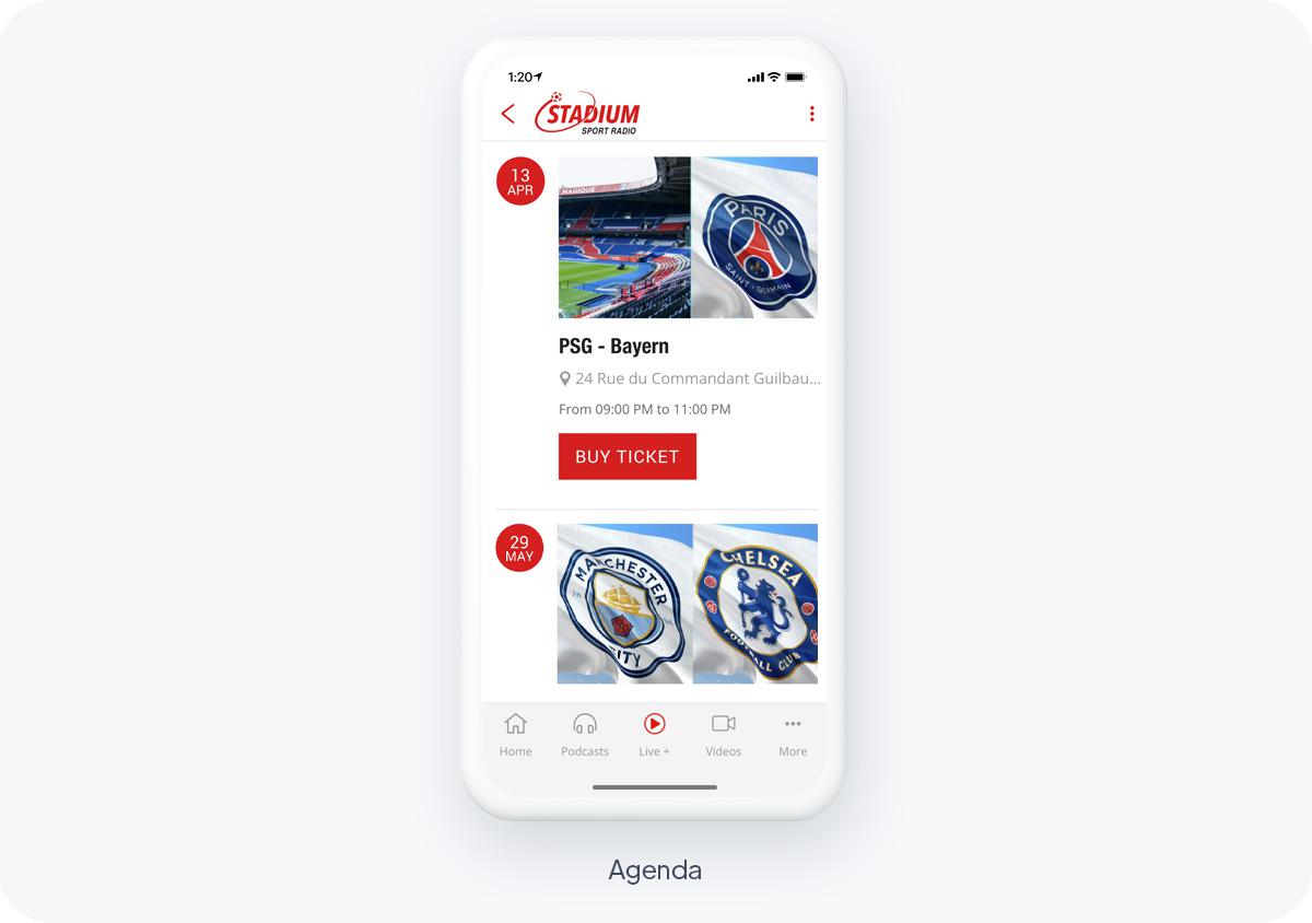
The rest of the homepage is dedicated to other types of content offered by the radio: videos, blog posts and agenda.
To highlight the primary content the navigation mode is concise at first glance but it is complemented by a sub-menu "more" which contains the secondary features of the app, that is to say the social features. The icons make the menu even clearer and make it possible to know every second where to find the content that interests us.

Radios can also be used to gather a community. This is the case of Campus Radio, which decided to offer an app to its listeners, all members of the same university. Its objective is to engage its community and to reinforce the feeling of belonging of the members of the university.
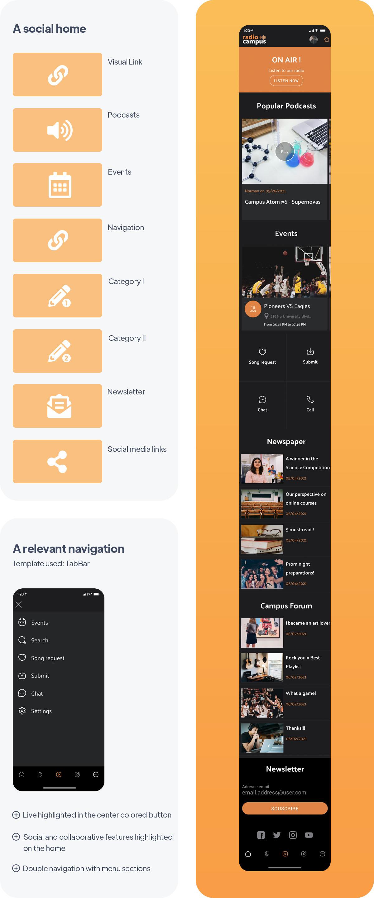
Live radio is the most highlighted feature in the app, with a contrasting banner in the first position on the home page and a contrasting central button in the navigation mode. Then come naturally the most popular podcasts and events.
With the objective of creating links between listeners, participative social features are highlighted on the home page: song selection form, user-generated content and a chat between listeners. Further down, we find the radio's blog and listeners' feedback. Finally, a module to subscribe to the radio newsletter and links to social media are proposed on the homepage.
The navigation mode is discreet, it almost blends into the home but it remains useful despite the fact that the main navigation is rather on the home. Menu sections have been used to organize the static content of the radio (Podcast sections for example). Listeners can easily navigate to the content that interests them.

With the Radio News app, we are getting closer to the objectives of a newspaper. Indeed, the vocation of this radio is to inform its listeners about fresh and general news. The app must therefore be able to inform the listeners quickly and simply and must present several content formats.
It is also important that the app allows finding information easily, that's why a search function is always within reach of each listener, in the header of the application. The home page presents almost all the podcast sections available in the app. Additional written content can also be found at the bottom of the page. Finally, the home page ends with a newsletter module and links to social media.
The menu, still as simple as in other radio apps, presents this time all the audio content of the app, including the Live section that allows you to listen to the radio live. The podcasts are organized inside a Menu section, which allows integrating a double navigation in the app.
Key features for a great radio app

GoodBarber provides you with a player allowing you to listen to live audio and video directly in the app. Fully customizable, it allows you to easily broadcast your radio shows or live videos from your backstage.
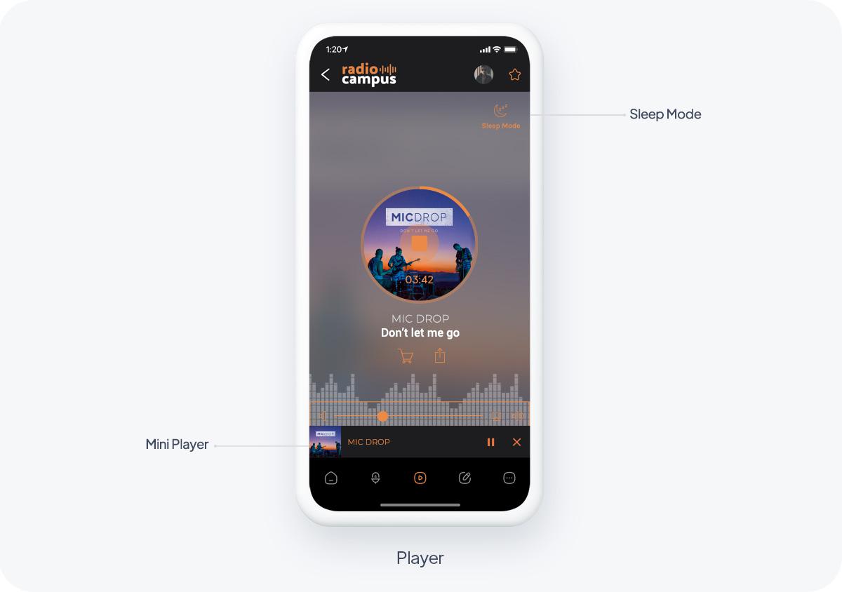
Your listeners can listen to your radio while browsing other sections of your application. A mini player is displayed in all sections of the app to allow your listeners to control the playback.
Background audio playback is available in native versions of your app: the broadcast is maintained even if your users exit the app, allowing them to simultaneously use other applications on their smartphone. They will be able to access advanced information about the track being played directly from the audio player: title, cover art, artist. They can also buy the track, or share it on social media in one click.
Finally, the sleep mode allows your listeners to choose their listening time using an integrated timer. Once the duration is over, the live broadcasting stops automatically.
Easily create your replay offer: your listeners will be able to listen to your shows anywhere and anytime thanks to podcasts. Each episode of a podcast can have an illustration associated with it, allowing you to choose either a visual per show or a thematic visual for each episode. The podcast episode detail view can be customized with additional content such as text or images to enhance your audio track.
Push notifications for smart communication
Use push notifications to announce the release of your new shows or episodes. The notifications are sent automatically: you promote your content and your interested listeners are sure not to miss a single episode of their favorite show. Think about it also to announce the beginning of a live show or to be reactive on current events. Rest assured, your listeners will be able to choose which shows or which type of notifications they want to be kept informed about.
Interactive features
Use the form to allow your listeners to interact with you: autograph requests, song choices, contests, or survey responses, the form is a great opportunity to give your community a voice. Also consider user-generated content to get them involved in your content creation by allowing them to send you images, videos or text.
Best practices to follow

Thanks to the Favorites section, your listeners can easily listen to your podcasts even without a network. Indeed, once bookmarked, your content is synchronized from your back office and stored directly in the app for offline playback. A feature that greatly improves the user experience and is very popular with today's listeners.
Present your programs clearly:
Use a calendar to allow your listeners to clearly view your program schedule and be alerted to the programs they are interested in with automatic push notifications. This is a great way to present your content and attract your listeners.
How to monetise your radio app
Think about "closing" a part of your app with a subscription system. For example, leave the live broadcast free, but submit some podcasts to subscription. Using a freemium model is a great way to introduce your product to new users and show the value of your radio app before they commit to a subscription. It is the easiest way to monetize your app and is much more appreciated by listeners than in-app ads.
Here are a couple of example to help you define a strategy to set up your paid content.
A radio app essentially offer a live listening service through the Live section as well as a replay option.
The first strategy could be to leave the Live section free, since it's when you listen to it on the regular radio, and restrict the replay section as paid content. In the case of a sport radio in the US, many listeners may not able to listen to the game live, due to different time zones. Sport fans would gladly subscribe to get access to the replay to their favorite games.
Another option is to offer paid video replays of your shows. Many major radio stations publish reruns of their shows in video format, giving the opportunity to show behind the scenes. This is especially interesting if you receive guest, host debates, live music shows, interviews etc. Making these replays a paid section is a great way to monetise your app.
The In-App purchase extension offers you the possibility to define exactly how you want your content to be accessed: what do you want to offer for free, what content should be paid, the duration of the subscription period, etc.
Once you've decided on which strategy to opt for to restrict your content, it's time to decide what types of subscriptions to offer and if you'll be offering a free trial and it's duration.
The ideal is to propose several subscription durations, with several price ranges, to suit a maximum of users.
A good practice is to propose increasing rates according to the duration. Generally, the longer the duration of the subscription, the more interesting the price becomes.
You can find more tips on which strategy to opt to monetise your app in this article.
Conclusion
Whatever your type of radio, an app will be the answer to many of your problems, and will allow you to increase user engagement and provide a more satisfying user experience.
 Design