How to create an app for online courses
Written by Angelina Casanova on
How to create an app for online courses
This is also the case for education: classic courses become boring or uninteresting. Compared to the attractiveness of the screens and the numerous contents they offer, most of the courses are no longer adequate with the evolution of society.
Learning methods must adapt to these changes, and digital courses are becoming more and more popular! This is why offering an online course app has many advantages: It is a format adapted to all profiles, depending on the age of your target, and your learning field. Creating an app will allow you to differentiate yourself by upsetting traditional methods thanks to diversified types of content!
In this article, we'll show you how to make an app by following a few easy steps following the examples of 3 apps: Learn&Fun, Fast Piano and Lotus Yoga.
From traditional learning to E-Learning: Identify the challenges
In a school setting, a student's maximum attention span in class is about 10 minutes. There are several factors that lead to this disconnect: Teaching methods, personal issues, general atmosphere, but the main cause is none other than digitalization. Information is instantly available on the web and learners are now used to more attractive formats.
Music, art and sports courses face different problems. In recent years, new obstacles have appeared, the population is becoming more sedentary and cultural and sports activities are less attractive. The commute, the crowds, time management, and budget restrictions are all factors that dissuade people from participating in these activities, and more and more of them are doing so at home. Social connections are now digital, so going out is not as important as it once was.
Creating an online course app is one solution. At home or away, alone or with friends, everyone can adapt their learning, and choose what they want to learn and how. By gathering all your content in one interface, your app will become as attractive as social networks.
1. Choose a Theme for your app
This is the first step to creating your app for your online courses.
While your app comes automatically with a template and theme, in the back office you will find more than 25 different themes created by our designers.
For example, the Learn&Fun app uses the Venice theme. The theme reflects the company’s image perfectly: colorful yet clear and clean. But you can choose the theme that best fits your design guide. But you can choose the theme that best fits your design guidelines. Fast Piano the Black theme and the Lotus Yoga app uses the Diamond theme.
2. Build your app Home page
The Home is the first screen users will see when opening your app. It is therefore an important feature of your app, both visually and practically. With GoodBarber, the Home lets you choose which content to highlight upon opening the app.
You can see in the paragraph about UX and content how you can optimize your modular Home by adding different types of widgets.
You will see further below in the article and of course your audience. For example, Learn&Fun specialized in school learning and creative activities. It is therefore intended for a young audience, with several specific needs. Their Home Is simple, intuitive, and comprehensive since it is intended for children. It has a clear layout and the content is arranged by theme so that users can easily find what they are looking for. While Lotus Yoga is an app for online meditation and yoga classes, which is therefore aimed at a completely different audience. Their Home highlights their preferred lesson format: videos.
*The content that initially appears inside the app is just set as an example, you can change and adjust it as you fill your sections with your own.
3. Build your Navigation Menu of your app
The Menu is used for secondary navigation within your app. Your Home already provides points of entry towards the sections of your choice, which is why you can even choose the option to not display a Menu at all, depending on your app. If you do choose to enable a Menu, you can choose between 7 different types of "menus" or browsing modes, to further distribute traffic within your app.
Building the Menu can be achieved independently of the number of sections in the app for complete control over the navigation of your app.
Here for Learn&Fun, we’ve selected the TabBar template. Visible and accessible at all times, it allows easy access to the content offered thanks to the menus in which the different courses are organized. As it’s designed with children in mind, it's soft and colorful, attractive, clear, and illustrated with icons that make it easy for youngsters to understand.
Your Menu can also feature links and shortcuts, to point towards destinations (internal or external), as well as titles and separators, to prioritize information within the menu (these two serve design purposes).
You can further customize your app by featuring your logo inside the Header, on the Home as well as within sections, where each section Header can be customized independently.
4. Add your Content to your online courses app
This is actually the most important part of our app!
To begin with, using the different sections organize each type of content (lessons, videos, podcasts, ), activities (E.g.: Exercises, practices, Events ...), and other information relevant to the app (E.g.:Gallery, Profile, etc), which are in the original menu.
Once the app structure is set, it's time to start adding the actual content inside the sections you've created.
If the content is created inside a CMS section, everything can be done from the GoodBarber back office, from writing articles to creating events.
If you choose to import content from external sources like YouTube or external Podcast, , you simply need to use one of our connectors and to configure the settings of the section when creating it - and if you need a helping hand you can check the detailed Online Helps or contact Support.
We're almost there ! Your app will be ready soon!
5. Design your Launch Screen and App Icon
You covered design and content, it's time for some final adjustments.
The launch screen is the first thing users will see when opening your app (before the Home). It will be displayed for a few seconds while your app’s content is loading (in a browser as well). You can upload an image you already have (make sure you respect the dimensions), but it is also possible to design it directly from the back office, using the Wizard Tool.
For the app icon, which will be shown on the home screen of users, you also need to comply with different dimensions, for the different operating systems, and for web app specifics (such as the favicon).
Creating the right app icon can be a little tricky: it needs to be self-explanatory while respecting the Stores guidelines. For instance, you might need to tweak your logo somewhat, so that it adapts to a square format.
Last but not least, don't forget to enter the name of your app .
The field that appears below the icon preview is the name of the app as it will appear on the Home Screen of the user's smartphone, for today's example: "FastPiano" and “Lotus Yoga”.
6. Test and publish your eLearning app
Your online course app is now ready! But before sharing it with the world, you need to carry out a series of tests to check if everything is running as you've planned. You’ll need to test all versions of the app that you’re planning to publish (native iOS, native Android, PWA, etc.), using different OS and different browsers as well.
GoodBarber provides a test app you can use to run preliminary checks on your app. The most optimal way to test your app, however, is through its AdHoc version, which is the actual file of the app that will be submitted to the stores that you can download onto and run on your device.
Other options are available: For native iOS apps, there is a specific tool provided by Apple: TestFlight. It allows testing your app before it goes online on the App Store. Android offers alternatives to Testflight.
Once you’re satisfied with the results of your tests, you can move on to the next step: publishing your app
Publishing an app can be a complex and slightly overwhelming process, starting with the mandatory step of registering as a developer on both Android and iOS platforms. The Apple developer account is $99/year. The Google Publisher account consists of a on-time fee of $25. Keep in mind that Apple requires the owner of the content in the app to match the owner of the developer account, so if you publish multiple iOS apps for different projects, each will need to have its own individual developer account.
The process of submitting an app to the App Store is slightly complex and requires thorough preparation. Apple reviews each app before approving them for release. Before you submit your app for review, you will need to provide a collection of information (Icon, app preview/ screenshots) and metadata (the name of your app, its category, a detailed description, and additional keywords for ASO). The review process can take a few days, Apple will notify you by email when your app is public.
For Google Play, after creating your app on your Google Play Console you will need to register the information that will be displayed on Google Play. It includes mandatory information such as title, short description, full description, graphic assets (pictures, app screenshots), category, contact details, privacy policy. Once the Store listing is completed, it’s time to upload your app bundle. (it contains all the elements of your application). Then follow the guide on the Google Console to deploy and publish your app. If your app is approved it will be released within a few hours.
Luckily, publishing a Progressive Web App is a lot simpler. Hosting is included with your GoodBarber subscription.
An app for every type of course and target audience

Once this analysis is done, you can choose the right design and interface. The user experience is the key point of the success of an app, that's why it's important to integrate the most coherent functionalities with your target while tuning the UX to their expectations. Here are some examples of apps created for different types of online courses.
1/ An educational app
The Learn&Fun app is specialized in school learning and creative activities. It is therefore intended for a young audience, with several specific needs: Learn fundamental course concepts according to age and level, while having fun through various fun and creative activities.
The home of this app is simple, intuitive and comprehensive since it is intended for children. It has a clear layout and the content is arranged by theme so that users can easily find what they are looking for.
The choice of the navigation bar was made in favor of a TabBar, visible and accessible at all times. It allows easy access to the content offered thanks to the menus in which the different courses are organized. These menus are very intuitive, and the entire design of the app is designed with children in mind: soft and colorful, attractive, clear, and illustrated with icons that make it easy for youngsters to understand.
The Contact Us and Gallery sections are intended for children as well as parents and allow to unite a community of users. They can share their photos, their moments, and make your app more active and attractive. It's an added value that builds loyalty and sends a trusted image to your users.
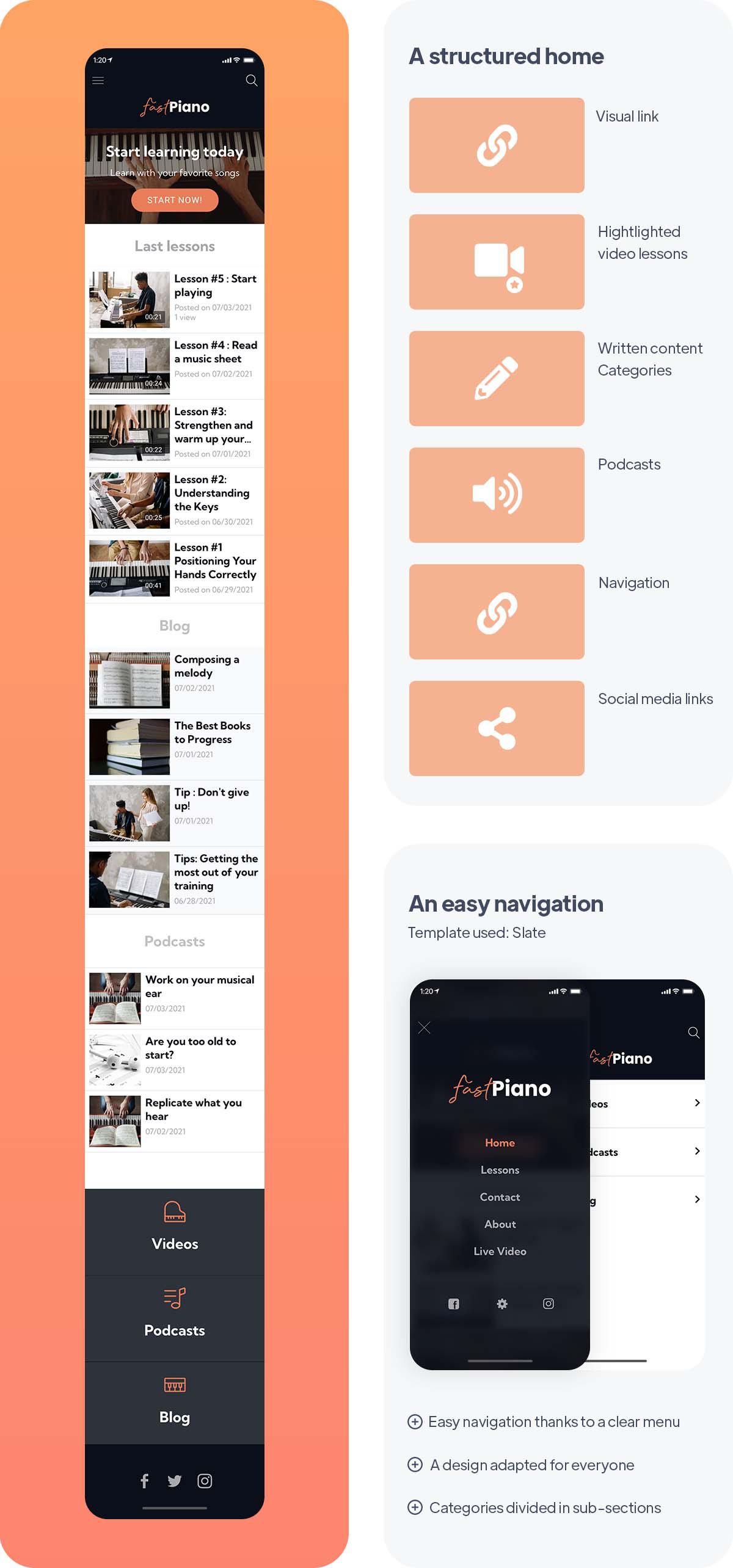
E-Learning apps are not only for informative, academic and formal courses but also for many different types of courses. Cooking, painting, sculpture, photography, but also music, can be subjects of online courses. The app FastPiano is an application dedicated to learning the piano online through many types of diversified content.
It's an application for everyone, which is aimed at a very large target audience whose motivation is to learn this musical instrument. Its design and its UX are more neutral, to be adapted to the largest number of people while remaining easy to understand and use.
The Home is minimalist. The main objective of this app is to propose several kinds of content in order to diversify the methods. Different media are used: video content through tutorials, as well as live lessons, podcasts, and written articles in the blog section. That way, everyone can go to their favorite type of content and find an adapted learning experience.
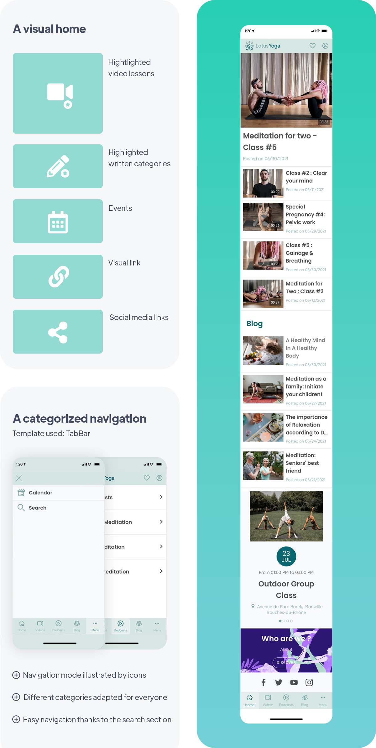
Online courses also include areas related to well-being and health, whether physical or mental. LotusYoga is an app for online meditation and yoga classes, which is therefore aimed at a completely different audience than the previous ones.
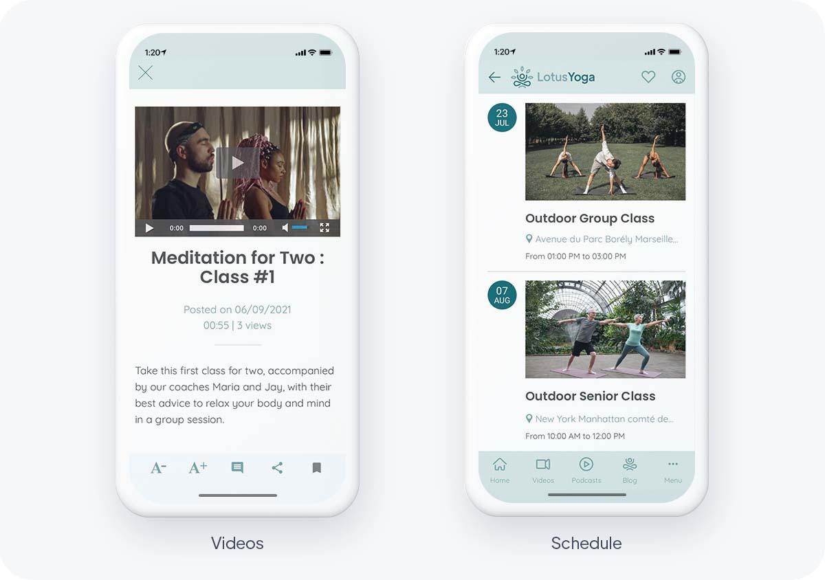
Like FastPiano, LotusYoga uses different types of content to vary its learning methods. It is the video format that is preferred and highlighted in the Home of the app. It is the most suitable content since it is possible to do a session at the same time as the coaches. Moreover, the videos are organized according to the needs of users, there is for example a section dedicated to pregnant women, a more specific target. There are also some additional articles and podcasts for truly complete sessions.
This app also aims to create a community of active users, thanks to the calendar. This allows you to organize events such as group classes, by giving meeting points using the location feature proposed by GoodBarber.
Key features for a good online course app
Your GoodBarber back office allows you to manage everything from a single place: thanks to a single interface, it is possible to plan the publication of your courses, manage your content as well as your users.
The planning and organization of your courses require the use of several features. You can plan your content in advance thanks to our calendar.
Our CMS allows you to categorize your lessons into modules and chapters according to their subjects. The different types of content can be internal to the app, i.e. published directly from the tool through the sections, but also external. Goodbarber offers a CMS to redirect your content and connectors to synchronize it from external platforms, there are about thirty connectors like WordPress, Youtube, RSS, Podcast Feed, Vimeo, Twitter, for example.
Offering a search engine is particularly important for online course applications, it will allow your users to find categories, topics, and relevant content according to their interests.
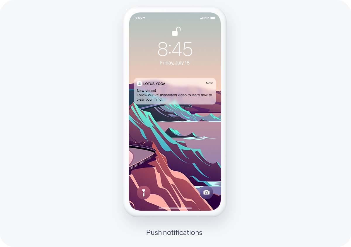
From your GoodBarber back office, it's possible to schedule automatic notificationsto be sent whenever new content is added to any section of your app. Ideal to automatically inform your users of new lessons available or live tutorials. They can also be targeted according to user groups, allowing you to adapt your strategy for each profile. It's a motivating, loyalty-building feature that reminds your users to come back to your app.
It's necessary to use built-in analytics as well as external tools to understand which courses work best. The GoodBarber dashboard provides you with detailed statistics of your app. This is data that will help you understand your users' behavior, and then inform the amount and type of traffic on your app. You can also use external tools, such as Google Analytics for Firebase, Google Tag Manager, Countly, or Flurry, to get more detailed results. Once all this information is taken into account, you can adapt and perfect your app according to your users' expectations.
How to monetise your online course app
Let's start with the easiest way to make money with your app: advertising.
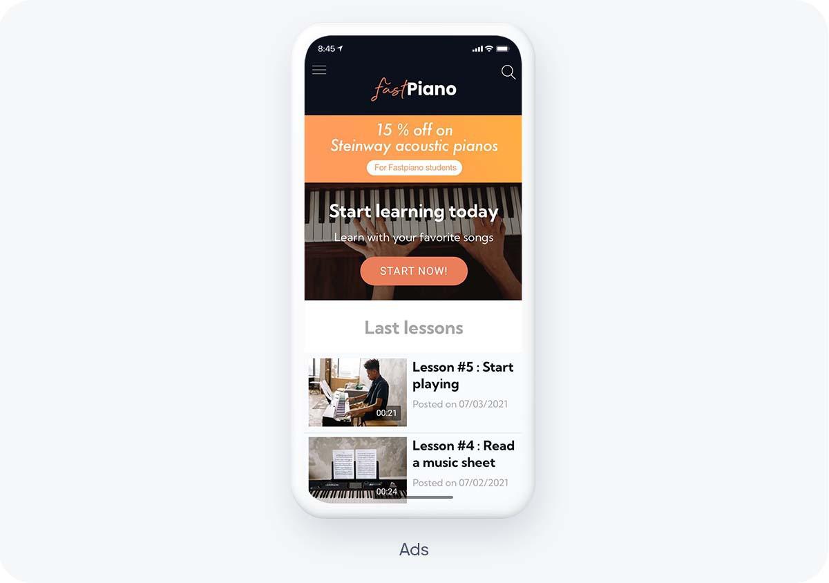
With GoodBarber, you can display externals and/or create your own ads and sell their placement.
- External ads: With the External ads add-on, you can connect to third-party ads network like AdMob, Ad Manager or Facebook. GoodBarber will retrieve and display automatically the ads.
- Selling ads placement: This solution suits both radio stations with high traffic and local ones. First, you will need to install the (free) Internal ads add-on. This feature allows you to create your own ads. It might be more interesting for you to deal directly with advertisers and/or local businesses to sell ads placements in your app. You can find brands that fit your niche and offer them to place ads for their products or services on your app. If you're a local radio, local events or festivals could be another option.
In-App Purchase has become very popular and lucrative, and especially subscriptions as they provide you with a recurring, reliable income as well as a more loyal and engaged audience.
When planning your content and deciding your strategy regarding your subscriptions, remember that the trial period is important to motivate the user to engage in learning.
While course sections should be subscription-based, after a first free trial course, additional sections providing more resources can be accessible also for free.
For example, if your eLearning app is for a musical instrument or a language, the course sections, such as the video section, can be subject to subscription, while the blog sections offering tips for progress, testimonials, bibliographies can be free.
The GoodBarber in-app purchases add-on offers you the possibility to define exactly how you want your content to be accessed: what do you want to offer for free, what content should be paid, the duration of the subscription period, etc.
Best practices to follow
Engage and Retain Your Students:
There are several ways to create engagement consistently through an online course app. First, the more diverse formats you use, the more engaging your courses will be. This is because users will be able to switch between a video, a blog post, or a podcast, making learning less redundant. Plus, Live is one of the best features! It allows your audience to react live and promotes engagement. By scheduling this through the calendar, your students will know when to meet up with you on a regular basis, and thus continue to use your app over the long term, feeling closer to you. You should also allow users to share content they find interesting on social networks, native sharing allows you to transfer any link or image to another app or platform (Facebook, Twitter, Instagram and many others) without ever leaving your app. The Favorites tab allows your learners to keep their favorite content in a separate section and find it whenever they want, which encourages interaction!
Create a real student community :
Many features allow your users to interact within the app. Comments allow them to give their opinions, ask questions, debate, and this way, they feel important. It's also a way for you to stay attentive to their needs and remarks, in order to adapt your app accordingly.
You can also allow your users to share content. Through the Submit section, they can send their requests, photos, impressions, and you can share them again later. User engagement and satisfaction is the best form of advertising, they are a reflection of your app, and they can be a great addition, whether it is simply informative or entertaining.
Add-ons Community, Chat, and User Groups, also allow your learners to communicate with each other and create bonds, a way to make your app more enjoyable to use.
 Design