Advanced customization of GoodBarber apps
Written by Mathieu Poli on


What I'm gonna show you is, how at the first look, GoodBarber is a tool that contains constraints, but how you can unlock all of his potential. For the average user, it's designed to be simple. But for you, that is probably the elite of nocode users, I'm gonna show you the constraints and how to overcome them.
The GoodBarber promise: Beautiful Apps
Our approach is a ready-to-use approach. The proof is that with GoodBarber, as soon as your app is created, it's ready to use. So why did we decide to do it this way ? We wanted to make the tool as easy to use as possible, with a very quick learning curve. And above all, what do we promise? We promise to make Beautiful Apps, meaning apps that have a functional & UX consistency.
We can compare an app builder to lego brick. Starting from scratch, you can assemble them the way you want. Us in GoodBarber, what we are selling is not just a bag of bricks, it’s the complete set to build your Darth Vador helmet. You don’t need to think about how it’s designed or what it looks like, we’ve put together a guide to build it. At the end, what is difficult for an app conceptor, is not writing code, this is not the main difficulty. The real one is formalizing functionalities. And our job as developers, more than writing code, is to design functionalities.
I’m gonna show you in 6 points why we believe this approach is the best.
Overcome the blank page syndrom
Building an app or a functionality from scratch means identifying & listing all building blocks needed. And most of all how to fit them together. All these questions generate a high cognitive load and could lead to a black page anxiety. What we're trying to do is provide answers to these questions, and sometimes even anticipate them. That's why we offer pre-built functionalities, our famous brick sets. We think it's easier to start with a pre-built feature and customize it than starting from scratch.

Time saving
If we take a common feature such as blog posts display, 90% of the time, we'll find the same bricks and similar agencement. You have a list display, a detail page display, functionalities of comments reading & post, sharing, etc. If we take another example like the authentication feature, here again, you'll find similar bricks and layouts: a login page, a user profile, a user profile edition page, a forgotten password feature, and so on. We’ll not let our users recreate the same sets every time. That's where the real time-saving lies.
Earlier, we were talking about the implications of design decisions, here we're on another very concrete point: avoiding wasting time. We're all familiar with these functions, and 90% of the time we'll find the same layout.
If you want the Darth Vader helmet with horns, it’s easier to start from the pre-built helmet and add what you want.
Avoid mistakes
Earlier, I was telling you that the job of a developer is to design functionalities but also to share his experience.It’s easy to make mistakes when we design an app. We’ve all seen apps with cool content but with a poor UX. For example, you can see apps with icons too small or something. I've already seen it’s too many actions in the same area. Here at GoodBarber, we try to share our experience by putting some safeguards to avoid common mistakes. One mistake that comes to mind is an app with too many action buttons in the header. In our the product, in that case, we automatically switch the header configuration to add an additional menu.
That's what I've been presenting to you as an approach that could look restrictive but, we see it more as a smart approach. Our goal is not to completely standardize our customers' apps, but avoid letting them make obvious mistakes.
Another key to the success and longevity of an app is to be at the top of the trend. As you know, in our industry, everything moves very fast. An app can quickly look old, in terms of both design and functionality. In GoodBarber, we have a team of experts who monitor trends and update our products accordingly. A good example is the TabBar that you can find at the bottom of screens. It has been mainstream for a long time and now it looks a bit outdated. At GoodBarber, we choose to refreshed this TabBar with a much more modern Floating & rounded version. Once again, our promise is to create Beautiful Apps.
Performance optimization
There are not only UX mistakes that we can make building an app, but also technical issues. Let me give you an example, I’m building a list of blog posts, but my database contains hundreds or even thousands of items. Common issues that we can find using a nocode tool are performances. My request takes too much time to download items, my page takes too much time to load and so on. Or again: if I want my articles to be available offline, I have to create a cache management system.
Even if the app is beautiful, if we don't put effort into its performance, it's unusable. At GoodBarber, we have tested and optimized each of the brick sets we offer. In my article list example, we've set up a 24-item automatic pagination system. This speeds up items loading times and maintains acceptable performance for this page. Also we've set up a strong cache management system that allows articles to be read offline. Basically, what we're doing is taking on most of the technical work for our users.
Accessibility & Privacy
Here, we come to two points that are a major challenge of our time: data privacy and app accessibility. It may seem secondary, but it's becoming essential. We work upstream to ensure that our customers don’t have to think about it. We make a constant effort to keep our apps compliant with data privacy regulations (GDPR for example). In the same way, work is being done on our side to make all our apps accessible. A good example is that a user with vision problems can use our apps without any issues. We checked the compatibility of all our bricks with Voice Over. This may seem less concrete than UX or performance, but we believe that making Beautiful Apps is also about making beautiful apps for all.
I've listed a number of points that may seem restrictive, but at the end, what's the point of making a customization that doesn't make sense? It’s not because you can do things that you have to do them ! In short, we firmly believe that the key to No Code lies in our philosophy: Beautiful Apps. Meaning apps that are consistent in every way, both in terms of UX and functionalities. And that cost our users a minimum of effort, since we did most of the work ourselves. When you choose GoodBarber, you're guaranteed the best results on the market. Our balance between guidance and creative liberty is our strength. You might think this limits flexibility, but in fact it's quite the opposite. Let me show you that in the next part of this presentation.
Example of a set of bricks

Now let's take a concrete example of a guided feature and see what it is really.
I’m gonna take the most basic example, but maybe the most powerful: the rich text display feature, which looks very simple in its approach, but capable of responding to a wide range of use cases, like touristic guide, press applications, and so on. What is this feature?
It's about displaying posts either in a simplified list display, or in more detailed single-page display. On top of that, we add a number of additional features such as bookmarking, reading and sending comments, and sharing.
First of all you need to set up the data model. We work on a data model that we consider as the most common and accomplished for this type of feature. Having this data model defined, allow us to propose automatically an interface to manage content.
Various starting points
We have talked about the data we're going to display, now let's see how to display it. In the product, you can choose between various layouts that you can use as the starting point of the customisation.
I’m gonna take as example the Enriched classic template. What it is ? It’s a list of cells that contain a thumbnail, a title, a suptitle, and so on.. Our engine is automatically managing some stuff like the text alignment for Right to left or Left to right languages or also specific displays for mobiles, tablets or desktops.
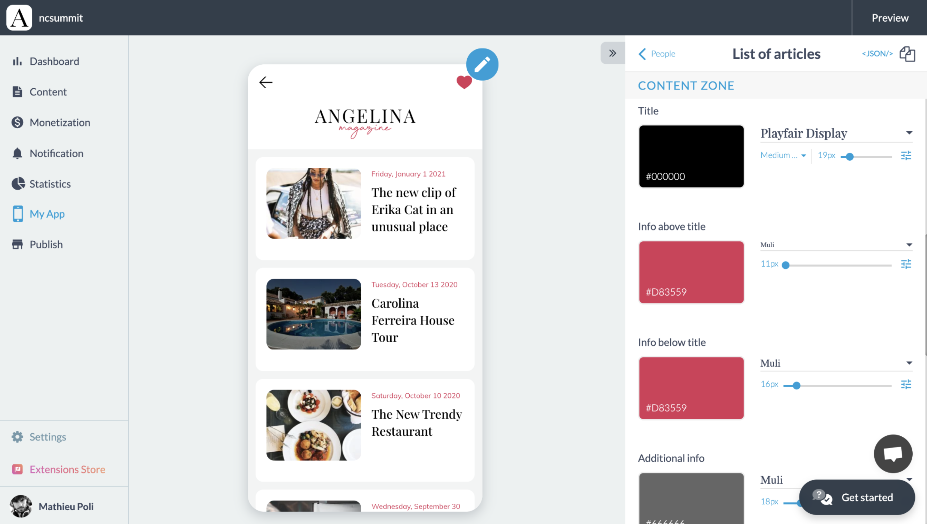
For the rest, we offer an interface with a panel containing the parameters most frequently used by our users:
We have an internal rule that says if a parameter is not used by at least 10% of our customers, we don’t put it in the panel. Why ? We want to keep an interface as simple as possible. That is the promise I was talking about earlier. But the reality, and this is what I'm going to show you today, is that these hidden parameters are still available.
Well, if you are read this article, it's because you're expert users, so you don't need this light and pretty interface. So if you want to take the red pill, I'm gonna show you what's behind the scene.
You will directly edit explicit parameters, and I’ll show you how.
Here in this demo, you’ll see how to add a shadow to all of cells of the list.
Now I finished my design but finally I don’t like this template & I want to change it. In one click I can switch to another template more immersive with a full screen image. And this is the strength of an integrated product like GoodBarber, all the set up I chose are automatically forwarded in the new layout.
As for now, I only show you how to edit layout parameters, but you can also find some parameters that change the functional part of your app. For example, I can activate an automatic scrolling of my items on my home page.
Another example is the rate at which ads are displayed. We've chosen to display an ad every 3 articles, but this is a value you can change. The display of ads is typically a safeguard we have set up because we consider that below a certain value the UX will be degraded, but if you still want to do it to generate more revenue, you can do it by editing hidden settings.
I've given you a few examples, but there are thousands of hidden parameters like these. This means that the number of possible combinations for our product exceeds one billion.
So how to do ?
First of all, you’ll need to add an extension to enable this hidden parameter edition. You can find it in our Extension store with the name JSON Edition.
Once installed, it will turn on a JSON button that will appear in each brick set of the product. By clicking on it, you’ll be able to edit all parameters of this brick set.
Here, I’m gonna modernize a bit the field of my login box. We choose to set them with a white background because it’s the most common configuration, but in this demo you’ll see that I’m able to change it.
We can even go further in the customisation. In this demo I’m gonna edit the color of the field just for the state focus.
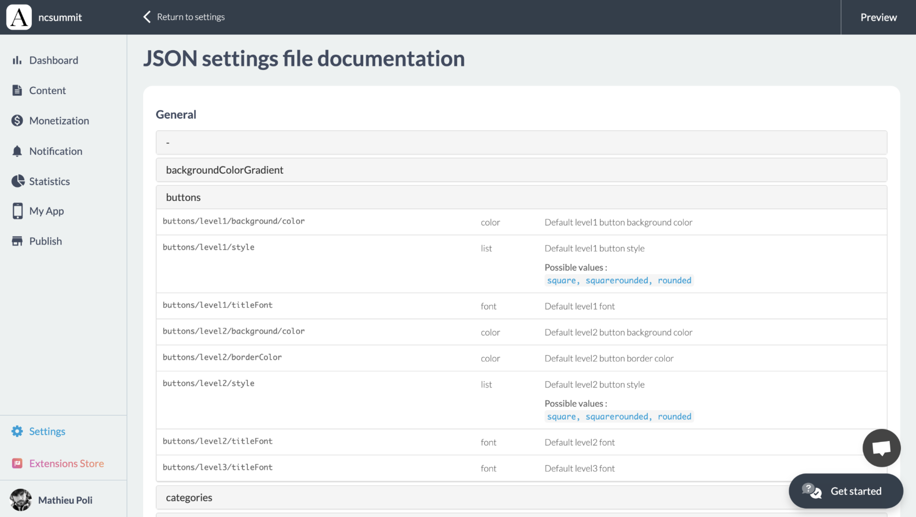
How to know which parameter exists ? There is a documentation that you can find in your GoodBarber backoffice. This list can look really long, but all of these parameters are based on our Design System which is built on an atomic base. It means that you will always find similar object formats & parameters.
We saw the example of the field object, another good example is the font object that will always be the same across the app, containing a size, a color, a font name.
So you should not be lost across of this list:

Feel free to contact our support team, they can help you find the settings you're looking for, or if they don't exist, point you in the right direction.
 Design