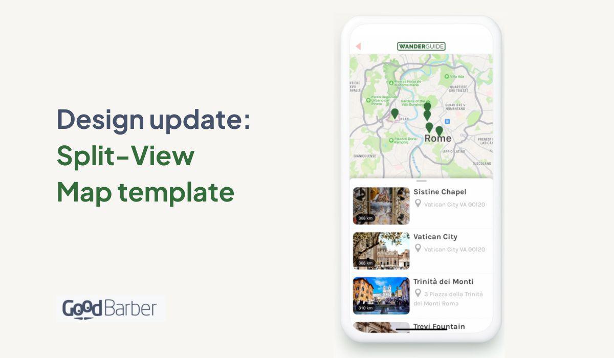
Design update: a new Split View map template
Written by Marie Pireddu on

And another design update for the Map section!
With this template, we complete the redesign of the map section, one of the most popular sections in GoodBarber. This template will be exclusively available on mobile.
Here we're offering a Split-view template as you can already see on Google Maps.
With this template, we complete the redesign of the map section, one of the most popular sections in GoodBarber. This template will be exclusively available on mobile.
Here we're offering a Split-view template as you can already see on Google Maps.
As with every new design, we always think from the end-user side and make navigating the app as smoothly as possible. This new template allows users to see exactly where they are currently on the map, but also what they are looking for without them needing to switch between different modes, map view and list view.
How to apply the Split-view template to my app

In your app back office, go to the menu Structure & Design > Structure > Sections > then click on your map section > edit list of locations. It will open the editing panel for this section. Select the split-view template and customize it to your liking.
When your users open the Map section, they will see the slip view between the map and the location list. They can easily switch between them by swiping up from the list to display the full list, or swiping down to show the full map.
 Design